
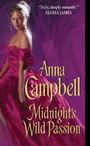
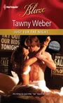
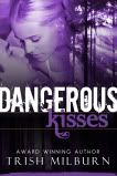
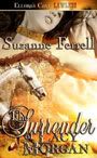
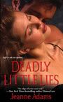
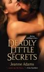
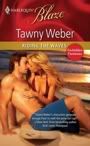
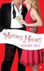
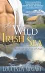
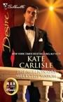
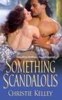
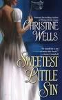
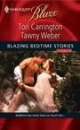
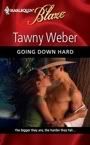
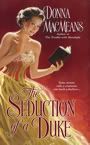
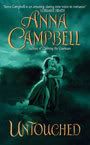
There's all sorts of covers. Sometimes they're sexy. Check out these from fellow Banditas.


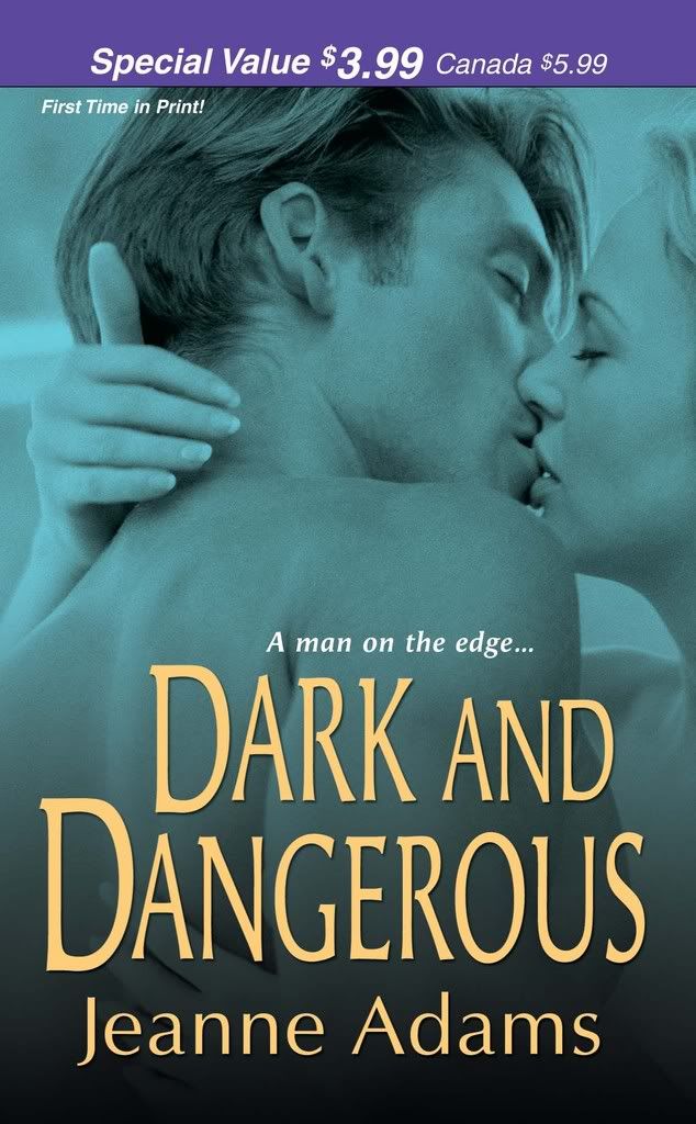
Gotta love those abs! Yum!
Gotta love the seduction!

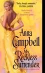
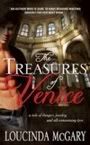
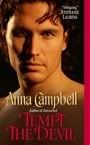
And sometimes they are just plain gorgeous.(Okay, I'm biased.)

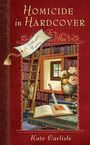
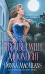
However, back to The Trouble with Moonlight. There is a slight error in the cover depiction. This is the story of a Victorian heroine who turns invisible in moonlight. She can't help it, it just happens. And it's just her skin, not her clothes. So to be technically correct, with that full moon shining up there over her shoulder, she should be invisible. The beautiful blue ball gown should be standing there up by its lonesome.
I suppose with the period crinolines and corsetry, that's entirely possible, but it wouldn't necessarily make for a sexy or a seductive cover - so I appreciate having the heroine visible. What would really be cool is one of those holographic covers where she would be visable if you look at her one way, then move the cover and she disappears ;-) But I'd have to be a bit further up the food chain for such an expensive cover.
My question for you: What influences your decision to buy a book?
Is it the back cover blurb? A story set in a particular era or exotic setting? Is it the first page? How far do you read? What do you look for? Do you thumb through the book looking for specific scenes? Is the length a factor? Are you miffed when the cover doesn't match the story? Or do you roll with the punches?
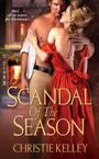
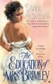
Of course there's Bandit booty to be had for a lucky commentor. I'm offering a signed copy of The Education of Mrs. Brimley, and a signed cover flat of The Trouble with Moonlight.
And don't forget to skip on over to RomanceNovel.TV where fellow Banditas KJ Howe and I are talking about extreme research - with extreme prizes offered as well :-)


94 comments:
I tend to go for the title first, then notice the cover artwork second. If the title is intriguing enough I will read the blurb no matter how god-awful the art!
And I will buy on the blurb alone - I never read the first page/chapter as a lot of people seem to do. Don't know why that is. I think I feel dishonest reading a book and then putting it back on the shelf - the old 'this ain't a library' kind of thing! Silly,isn't it?
Ooooh, just read some older posts. Having fluked the first post, do I get a rooster too, or only Banditas allowed? If so, what is the rooster (or shouldn't I ask)?
Your cover is gorgeous!!!
Hmmm... what gets me to pick up a book? Cover, of course :-) If it intrigues me, I'll turn it over and read the backcover blurb. If that intrigues me, I'll buy it. Like Kirsty, I don't read the first (or last, OMG!) pages. It never occurs to me. Probably because I have this thing about being the one to 'open' the book -- that thrill of being the first to bend the spind *g*. Far be it from me to steal away anyone else's cheap thrills!
btw - YAY Kirsty :-D Congrats on snagging the GR!
Kirsty, you do indeed get the Golden Rooster! He's a mythical beast but you have to promise faithfully to look after him and not paint him in camouflage colors like P226 does, OK? He bestows good fortune upon the owner all day ;-) Can't say much better than that, can I? Congratulations! And you didn't even try!
Donna, gorgeous cover! Love that blue dress! No wonder you're in love. Can't wait to read the book.
These days, because I spend so much time talking romance books, it's word of mouth that convinces me to buy. Mind you, I think that was always the most powerful influence. If I heard a book was great, I'd buy it. Covers certainly influence me but I've read so many great books with bad covers, they probably shouldn't. The blurb on the back does too. Have I read and liked the author's work in the past? That's a big one for me. A lot of people are just auto-buys, no matter what the cover or the blurb do. I don't read any of the book either. Seems like cheating - although I couldn't say why. And I certainly never read the last page! Actually, occasionally a quote from an author I love on the front cover will influence me at least to pick up a book and have a look at it.
The blurb is what influences me the most when deciding to purchase a book. If I like the storyline, then I'll buy it even if the cover is lackluster. I do agree that your first impression of the book is the cover. I get a little annoyed if the cover doesn't match the story or the characters' physical features.
Congrats Kirsty c on the GR have fun with him
I love that cover Donna love the colour of the dress such a lovely blue. I will pick up a book for the cover then read the blurb and see if I would like it, but more often it is word of mouth that makes me buy a book I visit a lot more blogs these days and take in the recomendations. I can't wait till June when I can read it.
I am really enjoying everyone over at RNTV you Guys are so much fun.
Have Fun
Helen
Hmm, I might sprinkle him with a little butter and thyme and th- oh, look after him you said. I'll kick the cats out and set him up on hubby's La-Z-boy with the remote and some popcorn (unsalted - looking after him, remember). Polish his beak, clip his spurs, he'll be one fine looking son-of-a-hen when he gets back to you.
You can come visit him Anna if the separation becomes too much- I am in Oz too!
Cover, title (WOW! you hit the jackpot on both!!) and blurb---and I always open to the middle of the book. Not sure why. But if it's a new name for me, that's how I shop.
Congrats, Kirsty !
Ah, Kirsty! I should have known it would take another fly Aussie gal to catch our fly roosty! And please don't cook him ;-)
Great cover,I'd buy the book at once!
The cover, the blurb or the author, all together I think. I buy most of my books from my internet-store, we don't have so many books in english here in Finland. But I'd love to see the books before I buy them, to feel them in my hands and to read some lines here and there...
I am attracted by the cover, hooked by the blurb on the back. I do sometimes get about in the middle and read just a little if it is a new author. If the cover catches my eye then you are half-way there.
For a new author, I look at the cover and the title before flipping over to the backcover blurb. Then I'll open it and read the first paragraph or two. If I'm hooked, it's going home with me.
Kirsty...congrats on the GR but there will be no butter and thyme on him.
Donna, that cover is beautiful. I love the blues they used, really eye catching.
And I do admit that I get a little irked if the cover art doesn't match the book descriptions. Only because I feel it such an important thing that the publishers and artists should pay more attention to it.
Gorgeous cover, Donna!
A great cover will entice me to pick up a book but it's the back cover blurb that helps me decide if I want to buy it or not *g* Sometimes I'll read the first page or so - depending on how much I've heard about the story and/or author.
Congrats on getting the GR, Kirsty :-)
Love the cover Donna. What usually prompts me to buy a book is word of mouth, be it from friends, blogs, etc. (Yeah, this blog has gotten me into A LOT of trouble as far as book budget goes!)
What a beautiful cover Donna! Love the blue shades.
For me, just about anything will influence my buying. First, if it is an author I have read before I'll buy it. If it is a new-to-me-author, sometimes the cover draws me in. Sometimes it is the title that intrigues me. Sometimes it is the back blurb. I like it all!
That is a gorgeous cover, Donna!
For me, the cover usually pulls me in first. If I like the back blurb, I tend to buy the book. Like, Anna, recommendations are a huge plus for me. I have discovered so many wonderful new authors due to my friends--many of them at RNTV!--and their glowing reviews!
Cover art is very important to me. It draws my first attention and tells me what I can expect from the book. Suspense, comedy, erotic romance... If I do pick up the book, then the blurb becomes all important. If it sounds interesting, I'll probably buy it.
Congratulations on nabbing the Golden Rooster, Kirsty c! I see he'll be sunning in Oz another day but in a new backyard. I can tell by his crow that he's mighty thrilled.
I remember I read an H/S long ago when the covers were fairly interchangeable in terms of artwork. However, the book turned out to be totally different than the blurb. The character's names were the only similarity to the fabulous story inside. I often wondered if they put the wrong cover on the book, but now I know they probably based the blurb on what the author originally said she would write - but then the author got an inspiration and seriously changed the story.
Have you ever picked up a book like that? Bought a book on the blurb only to find a different story inside?
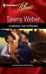
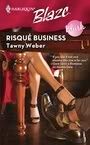
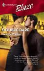
Tawny - You've hit the jackpot with those gorgeous covers of yours. Truly drool worthy - and I love the titles. They "dare" you to pick them up, right from the bookshelf.
I like that being the first to break the spine feel. I know what book I won't buy - the one that's obvious looked and time and time again and replaced on the shelf so open the cover stays slightly open. A turn-off for me.
What a gorgeous cover, Donna!! You're right, seeing the cover makes it real. I SO can't wait to read it! :)
For me, I have my auto-buy authors that I always buy. For new authors (like Christine and yourself), I liked the desciptions of your books and your personalities here at the Lair and other blogs, so I picked up (and LOVED) both of your books. Which, in turn, make you both auto-buys for me now. :) I will be picking up Christie's debut for the same reason. If people I know recommend a book, I'll usually pick it up based on their rec, as well. Plus, a great cover is a good perk. ;)
~Andrea
Chiming in with another cover compliment. I've had some shockers so I know how great it is to get one you like and even better if you LOVE it.
What makes me buy a book. Some are auto buys. Dont look at cover, title, or price ;-) New authors I will look at all - cover, title and blurb and always read the first para or two. If I'm not hooked then I dont buy. NEVER the last page.
I saw a woman once read almost an entire category romance standing in an aisle for an hour and then she PUT IT BACK!!! Bloody lousy cheapscate!! (?sp)
Anna - Of course, you love the blue! I have it on excellent authority that you're partial to the color. That and a particular shade of green *g*
I buy on reccomendation as well. Certain authors are on autobuy status (all the banditas are on that list, of course). I'm influenced as well by mention that the author has won a major award. That always makes me curious.
Hi Jane - I'm actually okay if the cover doesn't match the physical characteristics. It would be impossible for the artist to match the image I conjure up in my imagination anyway. I've heard that some authors go into the book in their final edits and make the heroine's phyiscal attributes match the cover. I hadn't really thought of doing that before, but I'll watch for those opportunities now.
Hi Helen! Truth be told, blue is my favorite color, and it'll make a lovely contrast next to her peach sister, don't you think? I know you like historicals, Helen. Do you think this one has a historical feel to it? I wonder as the heroine has her hair down which would be rather unusual outdoors.
Gillian - Thanks for the kudos on the title. Actually, my daughter came up with that one. I think she envisioned a whole "trouble" series. Me - I'm still concentrating on one book at a time. A series would be wonderful (Like Tawny's Dare series), but I guess it's hard for me to look that far ahead.
Eva S. - Finland? How cool is that! (oops, perhaps "cool" was the wrong word, let's go with "interesting" instead *g*). Is romance a hot seller in Finland? Thank heavens for the internet. It truly does shrink the world, doesn't it? Must admit, though, I do like to hold the book in my hand before I make the purchase. I buy research books off the internet all teh time, but I like to buy my fiction from the neighborhood bookstore.
Eva S. - Finland? How cool is that! (oops, perhaps "cool" was the wrong word, let's go with "interesting" instead *g*). Is romance a hot seller in Finland? Thank heavens for the internet. It truly does shrink the world, doesn't it? Must admit, though, I do like to hold the book in my hand before I make the purchase. I buy research books off the internet all teh time, but I like to buy my fiction from the neighborhood bookstore.
Dianna - new avatar! I like it!Another middle reader - see it's tough for me to judge anything by leaping into the middle of a book - unless that middle is a love scene *g*. I'm more apt to read the beginning.
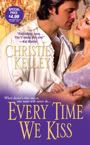
Christie - She of the hot cover, herself Christies *g*.
We get so little input into the cover art. I did mention to my editor that this book had a blue color feeling to me. I'm glad to know they listened. I wasn't sure hwo they would depict an invisible heroine, though. *g*
The cover design and font are key attractors for me. If they catch my eye - with color, tone, and a clear strong image - then I go to the back and read the blurb. If it doesn't hook me, I move on. (unless it's by an author I know LOL - because your covers have been great -- but bad covers do happen to good people.)
Margaret
Thanks Beth. I'm with you. A nice cover will get me to pick the book up, but the blurb will sell it to me.
Must say I love these tag lines that Berkley puts on the cover.
"Invisibility can be most revealing..." Nails the story, I think. *g*
Brownone - LOL - I know what you mean. I have these stacks of Bandita books that I've bought - not read - bought. I'm still looking for the time to read them but they are definitely must-buys. (I'd buy them even if AC didn't snap that crop at me *g*)
Buffie - you always have the best avatars. I'm curious - does it make a difference for you if it's the heroine featured on the cover, or must it be a hunky hero? Do you tend to pick up one over the other? Inquiring minds...
Gannon - RNTV is a great site. I love the videos, and I'm definitely partial to Gina's picks *g*. I'll be heading over there in a minute to see what lengths authors will go to research their books (and what lengths readers will go to get them)
When I first started reading romance (many moons ago) I picked up interesting covers and made my decision based on the back blurb. But for years now I've gone by the author. I would find one I liked and search for everything they'd written.
But now, almost every book I read is based on recs I get from my internet friends or stuff I find on boards and blogs. I've lost track of how many new authors I've picked up just because the author was sweet on a blog or a friend raved about a book. These are ones I probably wouldn't have gotten around to on my own.
I won't NOT buy a book because of the cover but these days, word of mouth is what puts it in my cart.
Completely forgot to say beautiful cover. So exciting. That one should have no problem reeling people in.
Fabulous cover and I love the story already! Congrats on the GR, kirsty c! Sounds like he will have a relaxing day in Oz once the butter washes out.
I have to admit an intriguing cover will make me pick the book up, but that back cover blurb is more likely to make me buy it.
At this point I have so many automatic buys walking through a bookstore WITHOUT buying something is like Mission Impossible for me!
And I do buy books on the recommendation of others. The Banditas Lair has blown my book budget into nonexistence, trust me!
Donna, I love your cover. It looks to me like she's fleeing a scene, had to dress hurriedly and didn't have time to do her hair. Why? We don't know, so we pick up the book to read! And as for her not being invisible, I think she was caught unaware on a formerly cloudy night, and the clouds just parted to let the moon shine down, and so she's ABOUT TO TURN INVISIBLE, but just hasn't yet.
How's that? ;-)
Way to go Kirsty on nailing that GR! He's a slippery fellow, though, so don't get too attached. Anna might sneak into your house later tonight...maybe you shouldn't have let it slip that you're in Oz...
Titles. I love catchy titles. Anything with the typical "Avon" clinch word in the title, I tend to just pick up at the library if I bother with it at all--in the case of bad titles, I have to like the author. "Whisper of Darkness" or "The Lady's Scandal" usually give me pause. I think I've just read too many romances in my life with titles with those words.
Titles that play off songs are funny. Or play off movies--I did love Julia Quinn's titles for the Bridgerton series--and I don't think the covers themselves were anything real remarkable. (Though there wasn't any half-naked woman with clothing that wasn't remotely credible with the time period, miraculously holding itself just over the tops of her breasts, with the kind help of the dashing duke who appears to be holding it in place...--so in actuality, Quinn had great covers.)
I do seem to like books with either the man's face on it, or profile (ie: Sherrilyn Kenyon's Sword of Darkness comes to mind) OR with the hero/ine's back revealed (i.e. 'Scuse Me While I Kill This Guy--which featured both a catchy title and a naked back.) Naked backs are more exotic for me, I guess; I'm tired of the cleavage.
Oh, must add: if the title and cover get my attention (or more importantly, don't run me off), I have to read the back to see if it's any good. A good blurb is essential.
Donna, your new cover is gorgeous! Like Kirsten said, I love the feeling that something is happening...
As for why I buy books, some are auto buys--Nora Roberts, SEP, etc. A great many these days are author friends and/or recommendations. But sometimes, I just see an interesting cover & crack open the book. If I like the voice & can see from the first few pages that the author knows what she's doing, I'm in.
Yep, the cover can definitely catch my eye and make me pick up a book, but it's the blurb and the author that would make me buy or not. Or if I've already heard good buzz :)
Donna, your new cover is gorgeous! (Don't enter me today ;))
Congrats on the GR, Kirsty!
I tend to look at the title. Some of my favorite books have cover imagery that, well, is just lacking, and certainly doesn't tell the uninitiated what you're going to read. One of them is a pseudo-fictional work which depicts "Blind Justice" being held at gunpoint by a heavily armed law enforcement officer. When I looked at that cover, it made no sense to me. But I was reading the book on a recommendation, so I ignored the oddball image. About two hundred pages in, the cover made sense.
Another recent (non-fiction) read just had red letters on white text with a mil-dot scope reticle. Turns out, that image on the front had absolutely zero to do with anything in the book. Nothing. Nada. I actually found myself wondering what the marketing strategy was behind that one. I'm still not sure I get it. The book was "ok" at best. It was one of those situations where I wish the author had used their own personal opinions and biases a little more like a seasoning instead of the main course. But I suppose that's what you get when you read certain types of books. I guess the key's just being savvy enough to recognize bias when you see it.
Something I've noticed, is that when browsing bookshelves, the eye is repeatedly drawn to certain colors. Bright ones. Blaze orange. Neon pink. Koolaid green. Every other product manufacturer on the planet has jumped onboard with the "bright colors attract eyeballs" concept. Yet, when I walk up behind my wife who's standing at the romance section, all the colors are subtle. Pale blues. Soft pinks. Maroons. Light purples. Those books wouldn't stand out against a white sheet of construction paper, let alone a shelf full of other similarly colored books. It's like "don't buy me" camoflage.
How much input do you guys get on your covers? Do the publishers make those decisions? Can you demand neon green?
Mostly I pick by the following rules:
1. Automatic buys...JGarwood, SEP, JR Ward, Sherrilyn Kenyon, Sandy Blair
2. Covers...Sexy abs, or the cover with a seduction on it. In fact, this book, One Night Only by Julia Latham calls to me everytime I see it in the store. I'm pretty sure I'll breakdown and buy it soon!
3. Synopsis on the back of the book.
4. Reviews...some can be trusted like our Jennifer Y. However, some of the reviews, especially negative ones on Amazon are strictly there to hurt authors, so I don't really go with those.
Oh, and Donna? I love the new cover as much as I loved the one for Mrs. B!!
Oh and the book I'm being seduced by is One KNIGHT Only. geesh, sorry Julia Latham that I screwed up your title!
Super post, Donna. I love looking at the new covers that are out. I never BUY a book based on the cover, but the visual of the colors and figures draws my attention first.
I don't care for covers with real people. I like my covers to look like a sketch or drawing rather than a photograph. That's just me.
But I'd never buy a book based on the cover alone. I always read the back cover and then at least two pages of the beginning. If I'm intrigued, the book she is mine!!
BTW, I really like The Trouble with Moonlight!
The cover and the back blurb are very important especially if the author is new to me :)
I have to say I love the cover of your second book... and I usually buy a book because I heard about it on a blog and was intrigued by the plot.
p226, I had absolutely no input on my cover. Went to the mail and opened up my coverflats to find two naked people on the cover of my book. Of course, I don't have to worry about whether they are wearing period clothing that way.
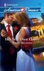
Donna, you already know I love the cover, and your title is awesome. Your title is the one I was most drawn to in 06 at the Golden Heart ceremony. I remember turning to my critique partner who was sitting beside me and saying "That's such a great title" when they read yours. And I think the same thing about this one. A bit of intrigue in the title and yes, attractive cover art draw me to the book if I'm just out shopping for nobody in particular, or choosing one of several titles by the same author.
And yes, I do read the back cover blurb--and even if I don't like it, I'll flip open to the INSIDE blurb--which is usually different if it's there at all. From there I go to the first page. If the author makes me turn it, I'll usually buy the book. So, Blurb matters more than cover, inside more than outside blurb, and First page--well--they're all a package. I try out several then pick the most attractive "package". But the writing is part of the package, and if I don't like the story line, I won't buy.
P226 said:
Something I've noticed, is that when browsing bookshelves, the eye is repeatedly drawn to certain colors. Bright ones. Blaze orange. Neon pink. Koolaid green. Every other product manufacturer on the planet has jumped onboard with the "bright colors attract eyeballs" concept. Yet, when I walk up behind my wife who's standing at the romance section, all the colors are subtle. Pale blues. Soft pinks. Maroons. Light purples. Those books wouldn't stand out against a white sheet of construction paper, let alone a shelf full of other similarly colored books. It's like "don't buy me" camoflage.
How much input do you guys get on your covers? Do the publishers make those decisions? Can you demand neon green?
We get very little. New authors often get NONE--some houses are better than others about sending out those "cover description" sheets where you get to list the physical characteristics--hair color and eye color and such--of the main characters. But we can't demand anything.
I'm thinking, actually, that this "neon green, etc." may be gender specific. I would not want a cover that color because I think it's an ugly color....and I would be reluctant to pick that book up off the shelf because I don't want to buy something ugly. So it may be that the colors in the romance section are meant to appeal to the main market for the genre--women--and the "knock me down with bright" colors are meant to appeal more to just any old body or maybe men in particular???? Just a guess, but given the choice, I wouldn't ask for those glaring colors because I'm not drawn to them. Hmmmm.
Also, I think women are generally more detail oriented and want the "mood" of the cover to match the "mood" of the book--we want the picture--the imagery-- as part of the story--not just something that smacks us in the face and says "buy me." This "buy me" hard sell is a turn off for me. And maybe I'm the only one who feels that way.
Hi Jane - Thanks for stopping by!
You're so right, A cover should give a sense of the book inside. I'm hoping my cover looks historical enough to convey that it's Victorian. The moon suggests the paranormal element, but fingers crossed on the historic.
LOL Andrea - I should print your comment and post it where I can see it BEFORE I revert to my snarky self on the blog. But I can vouch that all the banditas have wonderful personalities, otherwise we'd have a hard time surviving in the lair.
Amy - LOL on the cheapskate! That must have been a good romance though to keep her enthralled for an hour standing in the aisle. I'll pretend she couldn't afford the book but really needed the emotional lift of a good story. Yeah - that's the ticket *g*
Hi again!
Donna, I just have to grin every time I see your "Education" title. I thought I was so brilliant with my own title "Education of Lady Densworth", then I went to Dallas last summer, saw your cover flats, and my cp and I had the best laugh. Obviously I had read yours somewhere and "borrowed" it. :)
Forgive me, but I'm gonna pimp the Wet Noodle Posse Blog--they are doing a "What's your favorite inspirational quote?" today, and if you love quotes like I do, it's not to be missed.
Ok, ducking back to work....
Margaret - Boy, isn't that the truth! There's that old adage - don't judge a book by its cover, but yet so many people won't give a book a chance if it doesn't have a good cover - even if it's a great book. I've had two great covers, knock on wood. No complaints here. Thanks for stopping by!
Terrio - Thanks for the compliment. The internet is getting bigger and bigger in the promotion issue, isn't it? I think maybe it helps give new authors a leg up.
p226, I had absolutely no input on my cover
That stinks!
And I'm surprised to learn it.
Doglady - I can see you walking into a bookstore with that theme following you everywhere you go. (I was going to put the duh,duh...duh,duh,duh - duh theme in but it just doesn't translate well *g*) Then you find the book you can't put down and you hear those two sharp notes. Ta-Da. Perfect. VBG.
Kirsten - I love the way you write a whole story around the cover. I know some authors who start with a great title, then write a story to fit. You could start with a great cover and write a story to go with it *g*. Have you seen your cover yet? Can't wait till that one hits the shelves.
So it may be that the colors in the romance section are meant to appeal to the main market for the genre--women--and the "knock me down with bright" colors are meant to appeal more to just any old body or maybe men in particular????
This does not reconcile with an awful lot of products which compete fiercely for women's eyeballs (as chauvinistic as this may sound, and, please forgive me for it) and are primarily marketed to women on the supermarket shelf. Ever seen a box of Tide? Walking down a supermarket isle of cleaning products is a blitzkrieg of color. Bright oranges, bright greens, yellows, and yes, the occasional aqua or light blue. But by and large, products across the board are marketed in screaming colors.
Products for men are no different. Tools started coming in bright yellows and oranges many years ago. John Deere tractors are one of the brightest greens you'll see. All the guy-gear seems to be bright red or green. Mostly red. There's a reason all those mid-lifer's buy a red corvette. Attention attention attention.
*shrug*
Perhaps the colors in the romance section are more subtle because folks tend to read that stuff for escapism. If that's the case, then subtlety makes a lot of sense. Because, bright colors, while eye-grabbing, also tend to produce a little bit of tension.
I'm just still really bummed that you guys don't get to design your own covers!
It's an outrage I say!
I love covers! They are what make me pick up the book--but it's the back cover copy that sells me!
Nice cover, Donna!
MsHellion - I love the title 'Scuze me while I kill this guy. I heard about that in Dallas and knew I had to get the book.
You're right. Sexy backs are in. Lisa Kleypas had that Fabulous cover for Mine Till Midnight (another blue cover I might add) and someone else - can't think - had a drool-worthy naked back cover. Backs are hot.
Susan - Yes, I can see the influence of SEP on your voice *g*. Did you know that she used to teach high school here in Columbus? She comes back to visit periodically. Boy, I would have loved to have been a student in her class. Not sure I'd learn anything, though, because I'd be laughing so hard.
fichen1 - Are you getting sick of me today? *g* Thanks for the kudos on the cover. I know the cover is beautiful, but there's always this anxiety that it's not going to be well-received by the readers. So, believe me, the compliments really help.
P226 - Each publisher is different and some allow more author input than others. I understand the editors are the ones who work with the art departments to get a copy that conveys the story. The fact that I've gotten two really nice covers says fantastic things about my editor (Cindy Hwang, BTW).
I've heard other authors speak of art sheets but my publisher doesn't you them. Early on, Cindy asked me for examples of covers that I liked and she generally gives me an opportunity to give cover suggestions, but after that it's all in her hands. After the publisher has invested the money to commission the artwork, I doubt they would honor a request to change the cover neon-green. For one thing, they know what sells to the romance-reading public which is probably the reason for those pale pastels. It's not the screaming neons that catch a woman's eye (which is good advice as well for choosy neckties *g*). We like the suggestion of a sensual read. Subtle. Sexy. It's all about the fantasy.
Now, did you pick up the non-fiction book on a friend's recommendation? I think the covers of non-fiction work follow a whole different logic scheme than fiction.
Suz -
Nothing tops that cover for Mrs. Brimley *g*.
However, this book was done by the same artist. Can you tell?
I think it's interesting that the top two things you listed in your buying decision are things not prepared by the author - the cover and the blurb. You're so right about those negative reviews in Amazon. I guess they give the reviewer some warped sense of power. However, I guess it says something positive that out of the thousands of books to target with their venom, they chose yours. Something must have appealed to them *g*
I never really paid attention to reviews until I found myself being reviewed. I still don't give them a lot of attention except to appreciate that I've been chosen to be reviewed. I figure to each their own.
P226 - Do you get the feeling that Cassondra would prefer a simple black cover? VBG
Jo -
I hadn't thought about it before, but I think I prefer paintings or illustrations more than photographs as well - but I've seen some really great photographs.
I still think my cover (had the budget allowed it) would have been cool with an honest-to-God disappearing woman. VBG But I appreciate your support.
P226 - Do you get the feeling that Cassondra would prefer a simple black cover?
Hahahah, made me choke on my coffee. Maroon text on a black background. Yup!
Hi Nathalie & Lily -
Hmmm..I wonder how long a new author is a new author? I've had two beautiful covers (knock on wood) and I'm not sure how long my luck will last *g*.
Donna, love that gorgeous new cover. It's just as beautiful as "Mrs. Brimley".
A number of things will cause me to buy a book. I have my auto-buy authors, of course. Many books I buy these days also come from recs on the various blogs/bulletin boards I frequent. I've discovered so many terrific authors that way.
A cover will catch my attention in the store as will an interesting title. I'll read the back blurb before making the decision to buy, though. I don't read the first page because if I did that I'd still be standing there reading 20 minutes later! LOL! I never read the last page first and I don't read the middle either.
When I reach the point of the story where the hero or heroine is described and that description doesn't match the cover art it will throw me completely out of the story. For the rest of the book I'm thinking about that discrepancy and it drives me freakin nuts. Do the people in the art departments think we won't notice?
~PJ
I know you know the story of my title for Mrs. Brimley, Cassondra. But for everyone else, I had two different editors, two completely different publishing houses, tell me I'd have to lose the title. However, when my editor went into the marketing meeting and mentioned that the work was originally titled The Education of Mrs. Brimley, the marketing dept. wanted to keep that title. I'd just pleased (and amazed) that they did.
I think it's neat that you're the only one that has mentioned the inside blurb or exerpt. The publisher writes the back cover blurb and determines the cover, but that inside blurb is generally taken right from the author's work. I think this is a good way to get a sense of the author's voice.
I agree with you about the color schemes. FWIW, I read alot before I go to sleep. I don't want a cover that will wake me up again when I close the book *g*
Hey, Kirsten, don't frighten poor Kirsty! We all know Tawny is the wotten wooster wustler.
Donna, I had forgotten about that inside blurb. I do read that too. It's very helpful when I'm not familiar with the author.
P226, generally authors don't have a great deal of input. They ask me, I suggest! So far, they took up a couple of minor suggestions to add to what they were already going to do anyway with book three (it's not official yet but when it is, I'll let you guys know so you can check it out). But having said that, my covers have been gorgeous and I honestly have no complaints. I think all the Bandita covers have been great, actually.
Gorgeous covers!
I already have The Education of Mrs. Brimley so no need to enter me in the contest, but I would like to answer your questions.
What influences my decision to buy a book?
If I am familiar with the author sometimes their name is all it would take. If not, I read the back cover blurbs...flip through the book and read a page or two...or visit websites to read more about the books.
I want a story that is interesting to me so more often than not it is the blurb...which I have learned is not always written by the author so there have been many times where the blurbs haven't fit completely with the book that I have bought.
Sometimes a cover might catch my attention and get me to pick up a book, but they don't really matter to me...they don't make or break my decision in buying a book. I do collect coverflats though and have seen all kinds of covers.
I do have to say that some of the covers you have shown are much better-looking in person (if that is possible).
The new cover looks wonderful!
Donna yes I think it has a historical feeling even if her hair is down the dress is beautiful and with the moon behind her just gorgeous.
Have Fun
Helen
P226 - Sorry, I don't fantasize over laundry *g*
I have no problem relying on the marketing staff at the publisher to design the covers. They're the pros and have far more experience than I do. I'll stick to the writing.
Kirsty C., congratulations! You may be the first person to nab the rooster without knowing about him. As Anna C. says, he's mythical, so don't paint him or anything. The time p226 did, there was ominous talk of weaponry among the banditas.
Donna, I have to admit that the cover draws me in first. I also respond well to intriguing titles. Then I read the back cover blurb, then the opening, and then a random sample somewhere in the middle. That's only with authors whose work I don't already know I like.
If I'm trying to write something new, I'll pick up a sampling of those kinds of books based on which authors have the most titles on the shelf--highly scientific!
Eva S., I like the feel of the book, too. I suspect I'll be among the last e-reader converts because of that. Sometimes the smell of an old book is intriguing; sometimes it's alarming, if it's so intense that it signals the decay of the book. Paperbacks just aren't made to last.
Donna and Jo, I like painted covers, too. I'm not sure why; maybe they leave me more room to put my own visual interpretation on the characters.
Donna, all these covers are gorgeous. I wouldn't worry about yours being not exactly accurate. Maybe I've spent too many years reading comic books (my mom certainly thought so!), whose covers seldom depict scenes in the actual book, but cover/story discrepancies get about 3 seconds' thought from me.
Covers can get me to pick up a book, and if I like the sound of the back cover blurb I'll often buy it. I have almost never read the first page of a book before buying it. Weird, I know.
PJ, Jennifer & Helen - Thanks for the good wishes on my cover. I'm really psyched for this book to hit the shelves.
Okay, confession time... *I* am one of THOSE people who reads the last page before I read the rest of the book. Actually, not so much with romance since I KNOW I'm getting the HEA.
Yes, a nice cover will attract me, and yours are both WONDERFUL Donna! But like most everyone, I don't buy until I've read the back cover blurb, inside blurb and the first page. Unless it's a recommendation, which most all of my purchases have been lately.
AC
chewing nails to the nub worrying what MY cover is gonna look like
Donna, I love that blue cover!! And I've been dying to read it ever since I read the excerpt in the back of Mrs. Brimley.
Most of the books I pick up in the bookstore are ones I've already heard about online, so I usually know exactly what I want and just grab it and go. (Like Christie Kelley's book -- got it today!! Woohoo!!) But when I do feel like browsing, I'm generally drawn in by the cover, then I turn it over and read the back blurb, and if I'm intrigued, I usually read the first line of the book. Hey, sometimes I even read the acknowledgements to see if I recognize anyone :-)
Congrats, kirsty. Hope the lazy old bird enjoyed himself in the lounger all day!
P226 said:
This does not reconcile with an awful lot of products which compete fiercely for women's eyeballs (as chauvinistic as this may sound, and, please forgive me for it) and are primarily marketed to women on the supermarket shelf. Ever seen a box of Tide? Walking down a supermarket isle of cleaning products is a blitzkrieg of color. Bright oranges, bright greens, yellows, and yes, the occasional aqua or light blue. But by and large, products across the board are marketed in screaming colors.
Yes, but these are products that we HAVE to buy, and they're all competing with one another. None of them is a product that we buy for our own pleasuure or gratification. I think there's a difference. In direct contrast to cleaning products, which are necessary drudgery, and which the companies are probably trying to make seem more bright and cheery, look at the wrappings on good chocolate. Nobody forces us to buy chocolate, and the wrappers are subtle and reflect the yumminess inside. A far better comparison can be made between romance novels and fine chocolate, or good coffee, than can be made between romance novels and cleaning products. One we have to have, the other we buy for pleasure.
Products for men are no different. Tools started coming in bright yellows and oranges many years ago.
As a frequent user of tools, I think this is so you can find the tool on the job site. The first ones to come in the brighter colors were the ones most often used by professional contractors.
John Deere tractors are one of the brightest greens you'll see. Agreed, but they've been this color for over 100 years. Lots of other tractors come in less bright shades, and they're each known by their "brand" color. The color on a box of tide has been the same for my lifetime--that's 40 years. I think Tide, like John Deere, is practicing branding with the color of its products.
Not saying you're incorrect. I just think that when a woman is shopping for something she WANTS, a company would do its best to make that product attractive to her. I don't want to buy a book that looks like a box of Tide. I want to buy a book I think is pretty, and sets the mood for the story within.
Because something screams for my attention does not mean it's more attractive to me. And those colors you're speaking of are ones I'll avoid, not ones I'll gravitate toward.
Donna and p226 said:
P226 - Do you get the feeling that Cassondra would prefer a simple black cover?
Hahahah, made me choke on my coffee. Maroon text on a black background. Yup!
What IS this notion everyone has going with me and the dark thing????? ;0)
Oh, and you know, Kate is EXACTLY right.
If you want me craving a book, put an excerpt in the back of the one I'm reading now. I've been aggravated since I finished Mrs. Brimley that I don't have moonlight NOW. (grin)
That's the best marketing tool of all. I'll pre-order the book without ever seeing the cover if I've read an excerpt and loved it.
Sorry about that double post. Me and my love of the "back" button......
Ac - I'm anxious to see your cover as well. When's your release date? For me, I tend to see the cover about six months before publication, but other houses might be different.
Hey Cassondra -
You know, a lot of people told me that they wouldn't read that excerpt of Moonlighting in the back of Mrs. Brimley, because it ruins the read for them. Or when they pick up the book, they think they've already read it because they recognize the first chapter. To each their own I suppose. I've been advised not to use the first chapter as an excerpt up on my website for this reason.
Kirsty, congrats on nabbing the GR! I hope he is enjoying the lovely weather in Oz. Here, it is cold and, you know, January. *g*
Donna, I have to say, I am attracted to a pretty cover. Like many others, though, I always read the back cover copy. Unfortunately, I have found the "high concept" blurbs to be quite misleading at times.
The biggest deciding factor for me is name recognition, followed by cover recognition. I love it that I literally see the covers of your books and the other Banditas books all the time. They are imprinted on my brain! My mind picks up on them every time I see them in a store - even if I'm not looking for them!
Eva, hello to you in Finland!! Hope to see you back here soon!
Margaret, I had to laugh about your "bad covers happen to good people". It is so true!
It is also true that bad TITLES happen to good people. P226, titles are something else we have little control over. The publisher chooses most everything!
Donna, have you been following me in the bookstores? That is exactly how I shop!!
I tend to read the back blurb first and then the inside cover and if it sounds good I want to buy the book. The cover doesn't influence my buying decision. I will pick up a book if the cover is interesting to see what it is about.
Post a Comment