Showing posts with label covers. Show all posts

Thursday, July 7, 2011

All Covered Up!

Aunty is beaming with pride to welcome back her good writer-buddy and Lair favorite Kendra Leigh Castle, who is celebrating the release of her newest book Dark Awakening.

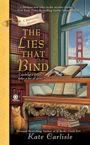
As you probably know, Kendra Leigh Castle writes dark paranormal romance and lives in southern Maryland with her husband, three kids, and a menagerie of pets. Find her online at her website: www.kendraleighcastle.com

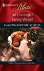
Thanks to the incomparable Aunty Cindy for inviting me back to the Lair! In gratitude, I have brought with me a hunk to share. Chocolate covered... my favorite!

So today I wanted to talk about (surprise!) the visual aspect of what makes us pick up a romance novel. I've just returned from RWA 11 in New York City, where I not only had an amazing time and got to sign my new release Dark Awakening, but I also somehow accumulated a duffel bag full of shiny new books even though I promised myself I'd behave on that count this year. Truth is, though, I'm a sucker for a good cover. And if that good cover, along with its story, comes for the price of free, it is finding a spot in my luggage. I'm a cover ho! I'm not ashamed.

At the Grand Central Spotlight, a Q&A where editors and publicists for that house discuss what they do for their books, there was some talk about the importance of the cover. You've got just a few seconds to catch a potential reader's eye so the art department has a HUGE task.

We've all felt the impact of a fabulous cover. And I'd guess we've all walked on by what might be a great book because the cover just didn't do it for us. I got a big kick out of watching readers wandering the Grand Central signing, of which I 
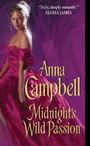
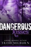
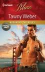
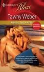
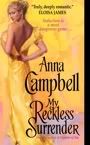
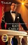
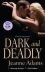
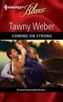
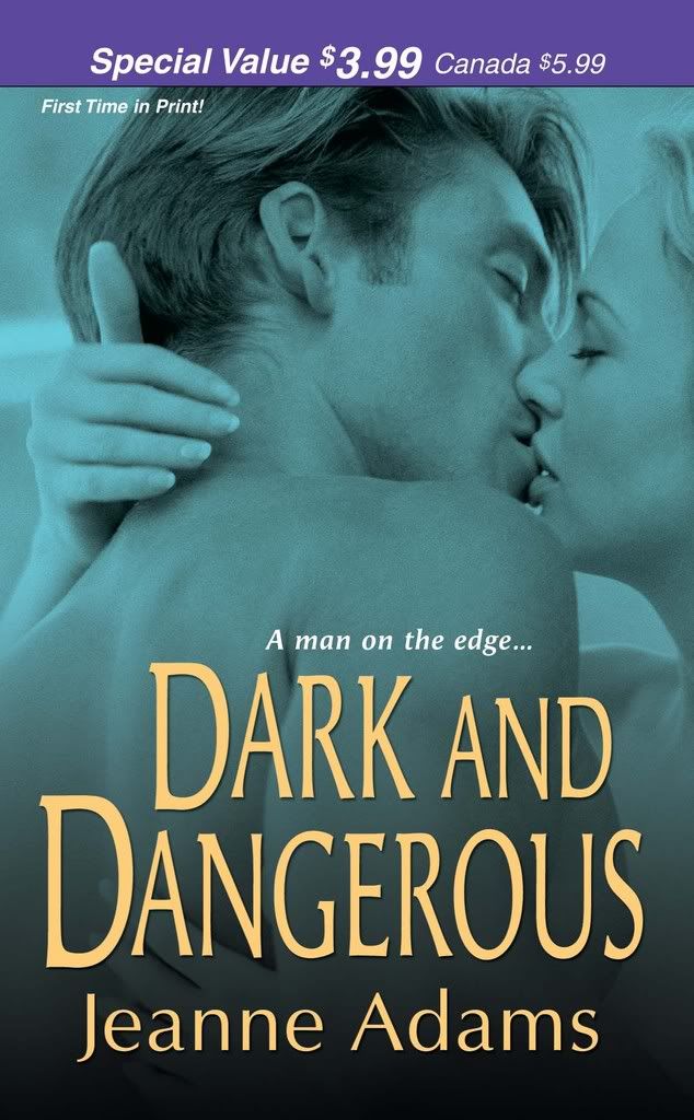
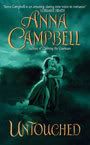
was proud to be a part this year, and scan the tables. They'd look, look... and then the eyes would dart back. The expression in the eyes was unmistakable, "Ooh. Pretty." I caught a fair number of people with this:

Now, I'm biased but my cover really works for me. Dark atmospherics, check. Cool font, check. Pettable abs framed by a leather coat, check. To me it all says, "This book has a hot, brooding supernatural man in it who totally gets naked at some point and YOU WILL LOVE IT! NOM! NOM! NOM!" But, uh, you know, that's just me. *AHEM* (Note from Aunty: actually, that was EXACTLY what I was thinking!)

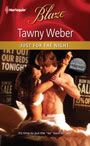
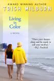
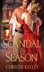
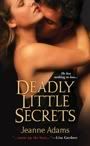
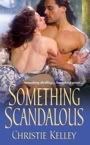
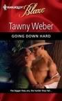
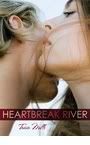
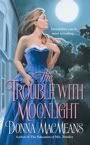
Now, it doesn't always have to be a guy on the cover. This is a release coming in the spring, no guy to be seen and even if I hadn't read a most excellent excerpt I'd be dying to grab it. Check this out:

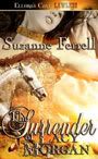
I love the fire and the kickass chick in a dress. It's got the "Ooh pretty" factor in spades. I notice I head for a lot of the female-centric covers, actually. For one thing, I know they're likely to be urban fantasy, which I've suddenly gotten into, but also, the image of a gorgeous, empowered woman who looks ready to take on the world is something that appeals to me. Take, for instance, the cover of Nalini Singh's Guild Hunters series: gorgeous heroine with weapons AND wings? Yes, please! I think maybe this is because we know, as the reader, that we'll be seeing the world through this heroine's eyes. We obviously want her to be as amazing as possible, since for the duration of the story, in some sense, we are her.

So what draws you to a cover? For me, it is less the gender of the person on the cover than the general feel. I want dark, lush, sensual for both paranormal and erotic paranormal. If it's an urban fantasy, I want warrior hawtness. I want the atmosphere of the book in a single mouth-watering shot. Which is why I'm pretty excited about the cover for my January release, Midnight Reckoning. I know, I know, shameless plug, but seriously:

So let's talk covers! What do you look for? Do you have a recent favorite? What makes you stop and grab a book?

I've got a signed copy of Dark Awakening for one commenter who I'll select at random. Aunty will announce the winner tomorrow, so be sure to check back!

Saturday, April 2, 2011

A Tale of Two (or More) Covers

by Anna Sugden

I'm delighted to welcome back a Lair favourite and a dear friend, the fabulous Kate Walker. Kate is not only here to share details of her latest wonderful book - The Proud Wife - but also to tell us some exciting news .... and give away an extra-special prize to celebrate! So, without further ado, I'll have you over to Kate.

Happy April Banditas – I really do think that Spring has started to arrive here in the UK. The crocuses (crocii?) are flowering, the daffodils are starting to open out in glowing yellow, and my new (well six month old) ginger and white kitten is out chasing flies and bumble bees in the sunshine.

I'm really happy to be able to be back with you to say Hi again and to share my good news about my newest title – and one of my older ones. Every new book that I have published is a real thrill. It’s a delight and an excitement that never goes away – no matter how many titles I have in my backlist. This latest, brand-new, beautiful ‘baby’ is one I’ve never seen in the shops before. It’s a ‘first’ for this title and seeing it in all its untouched beauty in a new cover, new title is a very special thrill.

It’s one of the best things about being an author. That feeling of seeing your work in print is something that never fades – or it hasn’t for me.

But with my latest book, The Proud Wife, a March release in UK, there was an extra edge to the excitement this time around. Because this was my very first paperback edition with the new style UK covers.

I’m assuming that you’ve spotted the new covers on the UK editions of the Mills & Boon books – but just in case you haven’t, here’s an example of how they've changed.

My last UK release, The Good Greek Wife, was out in paperback in this style cover

My current title The Proud Wife is in a UK cover like this.

I’ve had a lot of emails and messages from readers telling me just how much they love this cover – and I have to agree that it is beautiful. Stylish, elegant – and quite a long way from the clichéd clinch covers there used to be. I also love the fact that we now have great new titles – well, some are great and they’re all new titles and a long way away from the Ruthless Greek/Italian/Spaniard/Sheikh’s Blackmail and Revenge on the Innocent Virgin Amnesiac Housekeeper Heroine titles that were used for too long. The Proud Wife is a much better title.

But I have to admit that when I first looked at the cover of The Proud Wife, what I really thought was – huh? This may be a lovely cover - but it isn’t the cover to my book. The heroine on the cover my by lovely – but she’s not my heroine – not the Marina I’ve written about. My heroine is a feisty, voluptuous redhead, a woman of spirit, full of defiance. This woman looks cool, calm and collected - a bit icy perhaps. Can you imagine her throwing the papers containing her divorce settlement in the face of the man she once loved to the point of madness?

No, me neither! So I have to admit that, clichéd as it might be – maybe even a little old-fashioned - but as an author I like the cover of my Presents Extra edition that bit better. At least here my heroine looks as if she has a bit of a spark about her. She also had the red hair that so attracted her hero Pietro when he first met her.

But as a reader, and a buyer, I do like the new covers that Mills & Boon have brought out. I like the way that they have a freshness, a less stylised design. I like the way that the picture of the heroine/heroine/any combination of the two is above the title and underneath the title and the author’s name is another photograph that gives a clue to where the book is set or what happens in it. I love the way that every line – from Modern Romance Medicals, Historicals or the brand new RIVA – all have their own individual looks, designs that tell the reader only too clearly that these books all have their own flavour, they’re own style, they are not just more of the same, ‘cookie-cutter’ stories – which of course they are not.

Thinking about the new covers started me thinking about the way the covers of my books have changed since I started out over 25 years ago. (I was a child author, honest.) My very first cover looked like this (The Chalk Line) and they couldn’t even get the hero’s hair colour right. Then we had the ‘half a heart’ design (Flirting with Danger) The first set of photographic covers , the blue ‘swoosh’ (Good Greek Wife) and now we’re back to photographs again.

Of course, as an author, I have to say I love the emphasis given to the name of the person who wrote the book in the new style covers. And the change in the design of the covers shows how romance writing is a living, growing developing thing. Not just something set in stone and never altering. The new look M&B covers seem fresh and interesting on the bookshop shelves. But then again that Presents cover with it s white cover, the red banner at the top and the image in the circle has become a real icon over time – I know lots of people would hate to have it changed.

What do you think? Do you like the new-style covers? Would you like to see the Presents design given a make-over? Or would you prefer things to stay the same? And what are your favourite covers? Cover designs you really love – or the opposite? What about the ones you hate? Are you one of the readers that journalists claim are part of the boom in ebook buying because you’re embarrassed by the covers on the books? I’d love to know.

Which sort of brings me to my great news and my cause for celebration. Because one of my books with a cover I don’t like very much at all is The Konstantos Marriage Demand. It’s a cover that just doesn’t appeal to me. But I’m very very fond of that book because, as I’m now finally able to announce, The Konstantos Marriage Demand, has just been awarded Best Presents Extra 2010 in the Romantic Times Reviewers’ Choice Awards. I just wish I could be at the RT convention next week to pick up the award – but I’ll raise a toast to the book – and to everyone who’s going to be there anyway!

And as anyone who knows me knows that when I celebrate I love to share my joy – so to celebrate this award, I’m adding in a copy of The Konstantos Marriage Demand to my giveaway this time. I have two pairs of books – The brand new The Proud Wife and the Award winning Konstantos Marriage Demand - to give away to someone who posts a comment about the covers you like – or not.

You can find out all about Kate's books, and all the latest news by checking out her web site at: http://www.kate-walker.com or her blog at http://kate-walker.blogspot.com/

Wednesday, August 25, 2010

I Have A Cover!

By Kate

And it’s a beauty! (If I do say so myself!) It’s the cover for THE LIES THAT BIND, my November 2010 Bibliophile Mystery. It comes out barely two months from now!

Much of this book takes place at a fictional books arts center in San Francisco that I call Bay Area Book Arts, or BABA, and my cover depicts one cozy corner of BABA.

And pardon me while I gush, but I’m so in love with this room with its wall of beautiful books and its gorgeous view of the Golden Gate Bridge. There's Baba Ram Dass, the cat who lives at BABA, as well as a few clues scattered about. And it’s all as imagined by the brilliant artists at Penguin Books. I’m so lucky to have such a wonderful team working on my book covers.

Here’s the back cover copy …

One bookbinder. One bully. One beau.
Looks like someone has got to go…

When it comes to rare books and antiquities, Brooklyn Wainwright is a master. That's why she has returned home to San Francisco to teach a bookbinding class at Bay Area Book Arts. Unfortunately, BABA director Layla Fontaine is a horrendous host who pitches fits and lords it over her subordinates. With the help of her beau, Derek Stone, Brooklyn manages to put on a brave face and endure.

Unfortunately, someone else is not so forgiving. Layla is found dead from a gunshot wound, and Brooklyn is bound and determined to investigate. But when Layla's past ends up intertwined with Derek's, Brooklyn realizes that the case is much more personal than she thought--and the killer might want to close the book on her for good.

Dare I say it? I love this book! It’s got all my favorite characters: Brooklyn and Derek and Gabriel and Minka and Guru Bob and Mom and Dad, plus a few new ones you haven't met yet, but I think you'll enjoy getting to know them. Plus there’s a lot of San Francisco in this book, which is just about my favorite city in the whole world. There's mystery and romance ... and the occasional dead body, of course. What's a mystery without them?

So … do you ever buy a book based solely on the cover? When was the last time you did so, and what book was it? Who are your favorite ongoing characters in a series, romance or mystery? What city would you most like to read about? And how do you feel about cats in mysteries? :-)

Oh, did I mention that THE LIES THAT BIND is available for pre-order here? :-)

And today I’m giving away an ARC of THE LIES THAT BIND to one random commenter. So comment away!!

Tuesday, July 6, 2010

It’s all about the Money, Honey!

by Susan Sey

Big news today, darlings: Money, Honey—the book of my heart that I almost didn’t submit anywhere because it was so tragically flawed, the book I’ve been waiting to see in print for nearly two full years—that book? It hits the shelves today. Let the chandelier swinging/shield sliding/rooster grabbing commence!

I personally plan to sit around all day with a stupid grin on my face, nursing a ridiculously strong drink, and making suggestive remarks to the gladiators. I may talk the Golden Rooster into a tango later. He’s divine on his sharp little feet, & I feel like dancing.

But first, walk with me. Come on. This way, while we can still walk a straight line. Demetrius? Grab that torch, will you, darling? Sven? Be a dear & bring along that pitcher of margaritas. Watch your step, now, everybody. The stairs are a bit sketchy, the door jamb’s a bit low…but okay. Here we are, safe and sound.

Welcome to the Cover Art Hall of Fame! Why are we here, you ask? Why are we in a long, stone hall deep in the Lair, lined with giant, gorgeously framed prints of romance novel covers?

It’s the Fabio jokes. They’re killing me.

Okay, let’s back up. I’ll explain.

As you all know, a book release isn’t a book release anymore without the accompanying blog tour. And mine kicks off here, today, as you can see. But a handful of other blogs have graciously consented to host my shameless promo-hoing as well. And I’ll tell you the truth—as much as I cherish my Call Story, I didn’t feel up to telling it ten to twelve times over a two week period. If you’re interested in a fabulous retelling of it, however, RT has been kind enough to offer me their Debut Author Spotlight this week. I go into my Journey to Publication there. You can check it out by clicking here.

For those of you interested in traveling a little further afield, however, welcome to Susan’s Blog Tour in which I will, at each whistle stop, heroically address the Top Ten Responses Commonly Heard when an Ill-Groomed Stay-at-Home Mom Announces her Secret Career as a Romance Novelist. (For the details of where I’ll be next & what I’ll be discussing, see my website.)

And I’m kicking things off here with my beloved Romance Bandits. So let’s get started, shall we? We’ll begin, a la David Letterman, with Response #10: A smirky “Hey,will you get Fabio for your cover?”

Yeah, the dreaded Fabio question. This descends with depressing predictability into “I Can’t Believe It’s Not Butter” jokes and a retelling of the time Fabio got nailed in the face with a pigeon while riding a roller coaster. (Okay, I’ll admit, that one’s still funny.)

Now I have nothing against Fabio. In my mind, he ranks right up there with William Shatner in terms of people who’ve parlayed a somewhat limited & outlandish skill set into a career of remarkable longevity. So it’s not Fabio himself. It’s the way his name has become shorthand for the entire romance genre. It’s the way people seem to think that Fabio—and his enthusiastic embrace of the overblown & ridiculous—IS romance. And THAT offends me. It’s about as accurate as saying all young actresses are Lindsay Lohan. “Got a role in a movie, young lady? Well,then, here’s your ankle monitor, a ziplock of prescription pills & a gallon of Red Bull & vodka. Go get ‘em, princess.”

This is not to say romance novel covers—or what’s between them—are free of ridiculousness. (Christina Dodd’s famous Heroine with Three Arms comes to mind.) But the vast majority of romance novels have perfectly lovely content—and Fabio-free covers. Just here in the Lair, we have some gorgeous—and recent—examples from nearly every subgenre. Walk with me, darlings. Let’s have a look.


In the historical category, we have Christine Wells’ Sweetest Little Sin. Sheer sexiness, literally & figuratively, & not a mullet in sight. Fabio weeps.

In the Category category, we have Kate Carlisle’s July release, The Millionaire Meets his Match. Now this is a Desire, so pretty sexy, right? So where’s all the skin? Underneath that well-fitted tux, I’m guessing. Nice.

In the Romantic Suspense category, we have Jeanne Adams’s Deadly Little Secrets, coming later this year. Dark, dangerous & sexy, the contemporary version of a clinch cover. I get a really noir, old Hollywood vibe here, don't you? I’d be proud to read it on the bus.

And (you knew it was coming, didn’t you?) here in the plain old contemporary category, we have my beloved Money, Honey. Again with the sexy clinch cover but the playful version this time. We have flirt, we have sexual tension, we have a handful of cash for heaven’s sake. What we do not have is cheese. Fabio only wishes he were my Patrick. (I’m biased, I’ll admit it, but my Patrick wears a custom-tailored tux like most guys wear t-shirts. It’s like his native habitat, which makes my heroine a little crazy. In the very best of ways, though. I’d encourage you to pick up a copy if you’re curious about why.)

I recognize, however, that not everybody is as lucky as we here in the Lair. Bad Covers do happen to Good Authors. Unless you’re Nora Roberts, chances are nobody’s asking your opinion when it comes to cover art.

So in the spirit of Laughing So We Don’t Cry, here’s some classic Fabio action for you. Pour yourself a margarita, put on your Snarking Cap and come up with a caption that suits the action. The top three captions (as judged by me in all my subjective glory) get a free copy of Money, Honey! Thanks for playing, darlings!

Wednesday, February 10, 2010

My Reckless Cover!


by Anna Campbell

LOOK! LOOK! LOOK!

I have a cover for my June 2010 release, MY RECKLESS SURRENDER!

Isn't it sexy? And that yellow just pops! This is going to look fabulous on the shelves of a bookstore!

I love the tagline too -

Seduction is a most dangerous game...

Yet her heart begs her to be reckless!

She has rather a come-hither look in her eyes, hasn't she? Something completely appropriate for the character. My heroine gets to be quite a naughty girl in this story - as you can probably tell from that steamy stepback with all the bare flesh. And he's pretty tsssss hot too, isn't he? Clearly, being reckless has its rewards.

Here's the blurb:

Headlong into sin...

A well-practiced rake, weary of easy conquests and empty pleasures, Tarquin Vale, Earl of Ashcroft, knows women—and his every instinct warns him to beware of this one. Diana Carrick’s brazen overtures have thrown the haunted, sinfully handsome lord completely off his guard. Why, the exquisite temptress stated outright that she wishes to be his lover! But it is neither Diana’s boldness nor her beauty that intrigues him so—it is the innocence he senses behind her worldly mask.

Intent upon the seduction that will finally free her, Diana has set her sights on the notorious Ashcroft—never dreaming that there is much more to the enigmatic rogue than sin and deviltry. His kiss is bewitching, his caress intoxicating—and even the dangerous secret Diana must protect cannot shield her from Ashcroft’s dark allure.

Unwittingly yet most willingly, they are playing with fire. Now the fuse has been lit and there is no escape…except surrender.

You can read an excerpt on my website. Check it out!

And while you're there, why not enter this month's contest which gives you a chance to win a signed trade paperback Aussie edition of one of my books? The question's really easy. Believe me, if you've seen this blog, you'll KNOW the answer, snork!

As has often been pointed out, the Banditas have been REALLY lucky with the cover gods. I think this is another one to add to the roll! You'll notice this is my first cover to feature a girl on her own. In fact, this cover to me is reminiscent of Christine and Donna's more recent releases. Definitely the glint in the heroine's eyes is something all of them have in common!

So what do you like to see on a cover? A clinch? An object of relevance to the story? A girl on her own? A guy on his own? An animal (I love Kate's cats!)? Does the cover ever convince you to buy the book?

And hey, don't you think
MY RECKLESS SURRENDER's cover is indeed magnificent? LOL!

Friday, July 10, 2009

Cover Story


by Anna Campbell

One of the best bits of having a new book out is seeing the cover! Well, it is if you've been blessed the way I and other Banditas have been blessed by the cover gods (very capricious deities who must be placated with much worship and regular offerings of Tim Tams).

A couple of weeks ago, I got the final version of the cover for my 27th October release, CAPTIVE OF SIN. And I can't wait to show it to you.

I just LURRRRVVVVVE it. So much going for it. I think he's really handsome. I think she's really pretty. It's not cheesy at all. The stepback picture says something about the relationship. Why? Well, you'll just have to read the book to see but the two of them looking at each other longingly certainly fits.

It's one of those half covers - there's a fashion for them at the moment. So the picture of the hero peeks out in a come-hither way from the stepback (I'd come hither! Hither me now, mister!). The white is textured with twining roses and it's a lovely pearly color and the red is foil and really stands out against it.

I'm absolutely delighted, as you can imagine!

Covers are such an important part of a romance novel - obviously not as important as the deathless prose inside but still highly significant. I actually like a clinch cover if it's well done - not so keen on girlies on their knees looking up worshipfully just before they you know. Especially when those covers always seem to be set in unlikely places - the deck of a tossing ship or on a rock near the sea where the protagonists are about to be swept away and I don't mean by passion.

One of the reasons I like a clinch cover and why I think they've never gone out of style, in spite of how people whinge that they're clicheed and embarrassing, is that they scream romance. You know just what you're getting when that hunk and that willowy chick are clutching each other on the front of a book. My mother always made me laugh. She used to call it the girl in the nightie and the man with the flowing hair and the bare chest. The flowing hair isn't so big anymore but, yep, I'd say the nightie and the lack of shirt are still there. Six packs rule!


All of my covers have been clinches. Great clinches! Even TEMPT THE DEVIL which featured the gorgeous and omnipresent Nathan Kamp's face on the cover had a clinch on the stepback. A clinch by the seaside, but at least they're both upright and well above the waves. I'm not really expecting them to be washed away unless there's a tsunami some time soon.

So I started thinking about recent covers I really liked. That's always fun - much more fun than polishing a manuscript! What's unexpected is none of the covers that really took my eye lately are clinches. By the way, Bandita covers are exempt from this survey - gorgeous as they are!

My first selection is almost as omnipresent as Nathan Kamp. I think the cover for TWILIGHT by Stephenie Meyer is an absolutely brilliant piece of marketing. The rich colors, the pale arms, the red, red apple like something out of a fairytale. Yum! It's simple but it's so effective and evocative. Another apple cover I think is really clever is Jennifer Crusie's WELCOME TO TEMPTATION. Back in the year 2000 when that book was published, that cover was revolutionary with its simple apple with a bite out of it on a plain red background.


Another set of covers I think are really great are Nicola Cornick's BRIDES OF FORTUNE trilogy, out June, July and August this year. Nicola's a lair favorite and I love her books. But even without knowing that, I'd pick up these three beautiful books with their rich colors and elegant images. Speaking of fashions in covers, people chopped off at the chin or the nose seem to be the thing at the moment. But I think these are particularly nice examples. I've only got room for THE CONFESSIONS OF A DUCHESS with its intensely red dress on that lovely patterned wallpaper background. But check out the other two, THE SCANDALS OF AN INNOCENT and THE UNDOING OF A LADY.

My favorite recent cover, though, is for a book by another lair favorite, Eloisa James. I think this cover for THIS DUCHESS OF MINE is breathtakingly romantic. Eloisa always gets lovely covers but on this occasion, the Avon art department excelled themselves. That soft pink really takes my eye - especially in a sea of more overtly sexy images.


So what conclusion have I reached after this lightning survey of recent covers? There are obviously certain things I like. To my surprise, it's not half-naked hunks although I must say they're pretty appealing too. But when I'm picking favorites, I seem to go for apples (who knew?) and headless women in pretty dresses. Not the answer I thought I'd end up with at all!

Oh, and I absolutely love my covers especially the CAPTIVE OF SIN one. Which features neither a decapitated chick (hide your eyes, rooster, I know you hate to see 'chick' and 'decapitated' in the same sentence) nor a piece of fruit. Perhaps that can count as my shirtless hottie selection.

By the way, you can find the blurb and an excerpt from CAPTIVE OF SIN (including another chance to drool at the pic) on my website.

So what do you like in a cover? Love or hate clinches? Love or hate the headless brigade? Do you have a favorite cover? Let's talk romance novel covers!

I'm flying to Washington D.C for RWA today so probably won't be in much but I'll get back to answer comments as soon as I can.

Wednesday, January 30, 2008

Cover Story

by Donna MacMeans

I’m in love… I just received my cover for my second book, The Trouble with Moonlight. It won't be released until June, but just having the cover makes it real. A good cover, I think, is the first step to making a sale. If the cover is intriguing, I'll pick it up, check the back, and decide whether to purchase. I don't always read a few pages inside, especially if I'm familiar with the author. But with a new author - sometimes, but not always.

There's all sorts of covers. Sometimes they're sexy. Check out these from fellow Banditas.


Gotta love those abs! Yum!


Gotta love the seduction!


Sometimes the cover tells a story, like this one from Christine Wells.


And sometimes they are just plain gorgeous.(Okay, I'm biased.)


However, back to The Trouble with Moonlight. There is a slight error in the cover depiction. This is the story of a Victorian heroine who turns invisible in moonlight. She can't help it, it just happens. And it's just her skin, not her clothes. So to be technically correct, with that full moon shining up there over her shoulder, she should be invisible. The beautiful blue ball gown should be standing there up by its lonesome.

I suppose with the period crinolines and corsetry, that's entirely possible, but it wouldn't necessarily make for a sexy or a seductive cover - so I appreciate having the heroine visible. What would really be cool is one of those holographic covers where she would be visable if you look at her one way, then move the cover and she disappears ;-) But I'd have to be a bit further up the food chain for such an expensive cover.


My question for you: What influences your decision to buy a book?

Is it the back cover blurb? A story set in a particular era or exotic setting? Is it the first page? How far do you read? What do you look for? Do you thumb through the book looking for specific scenes? Is the length a factor? Are you miffed when the cover doesn't match the story? Or do you roll with the punches?

Of course there's Bandit booty to be had for a lucky commentor. I'm offering a signed copy of The Education of Mrs. Brimley, and a signed cover flat of The Trouble with Moonlight.


And don't forget to skip on over to RomanceNovel.TV where fellow Banditas KJ Howe and I are talking about extreme research - with extreme prizes offered as well :-)

Sunday, October 21, 2007

Cover Me!

by Christine Wells
Hi all, I'm swinging by to fill in for our Bandita Kirsten who isn't well today.

My friend Denise Rossetti came over the other day, bubbling with excitement about her upcoming cover conference at Berkley for her Four-Sided Pentacle series. Incidentally, here is the cover for her Avon Red short story collection, A Red Hot New Year--isn't it HAWT?!

It got me thinking--hmm, won't be long until my cover for The Dangerous Duke comes up for discussion. Better avoid my WIP, er, I mean, do my duty, and find some images to suggest for my cover.

Now, it's a commonly held belief that authors get no say in their covers. That's true. Once the cover is done, you have to have the clout of someone like Stephanie Laurens to get it changed.
But when my editor asked for suggestions, I had a Word file of pictures I'd copied from the internet to show her and the art department my ideas, what Sebastian and Gemma looked like, the settings I'd used for each of their homes and some of the scenes in the book. I'd also spent hours going through covers until I found ones that captured the mood of Scandal's Daughter.
"Show, don't tell" is a good policy in this case. As writers, we deal in words, but it makes sense that an art department thinks in terms of images. It's so much better to show them the kind of cover or the kind of mood you're looking for, rather than tell them. They might come up with an entirely different vision from the one you intended just from a verbal description.


So here's what happened for my Scandal's Daughter cover. These are the first images I came up with:

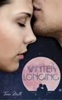
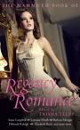
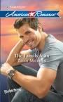
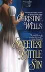
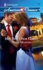
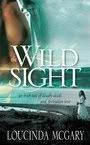
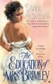
I had in mind a romantic but not overly sexy clinch, perhaps the couple waltzing.

However, my editor saw Gemma on a horse, riding about the estate. So I found images of period riding habits as well as images of women riding side-saddle in habits very similar to those worn in the Regency.
I also found covers I liked that showed a heroine and a house. Look at the Almost Innocent cover and then look at mine. Do you think the art department paid attention to my suggestions?
They also got my heroine's hair colour right, which I think is SO important! I was delighted with the result!


I love my cover--it's so pretty! Can't wait to see what they do for The Dangerous Duke!
So, dear readers, what do you like to see on a cover? Any turn-offs? Have you ever bought a book purely because of its cover?