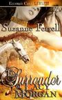
by Suzanne
As many of you know I recently sold my book The Surrender Of Lacy Morgan to Ellora's Cave. While waiting for the release date, I'm busy doing things like working on the next book and trying to form a web presence so people will have a place to find out about the book. (My yelling it from the mountain tops aside!)
So I've hired a young IT web designer to develop a webpage for me. She's smart and has a background in both art and design, so I'm looking forward to collaborating with her on this. One of the things she's asked me to do is review other romance authors' websites and see what details I like or want in mine and what font I'd like to showcase in the title and page bullets.
No problem. Right? I'm a woman and a romance reader. I won't mind shopping through the sites.
Do you know how many romance sites there are?!?! I stopped counting at 1500! And I was like in the P's. But undaunted, I started clicking each and everyone open.
Here's what I discovered:
 1) There are a multitude of genres and combinations of what authors can write if they choose more than one.
2) Some authors like subtle colors, while others like deep, dark colors and still others choose rather wild, vibrant combinations. (My eyes are not happy with some of the neon color combos!)
3) Some authors have highly professional looking home pages, while others look as if they were done at home with a template from the 80's. And others have fancy gizmos like flash movies and scrolling banners, hearts and flowers.
4) Some work....some don't. Some just plain need to be removed because the host site is no longer in use and the reader can't access the author's webpage at all. (But that'a a whole other discussion.)
So, since many of the Bandits are in Orlando for the National Romance Writer's conference, moi included, I thought I'd keep y'all busy with a little tour to see what sites I found that I thought "worked". Keep in mind the Bandits don't do snark, so no "didn't work" sites are listed...and there have to be 2000 or more sites all together, so I picked only a handful or two to share!
First, let's get my definition of what a good website should do:
1. SELL THE BOOK.
2. SELL THE AUTHOR
3. SELL THE GENRE
4. DON'T HURT MY EYES

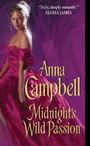
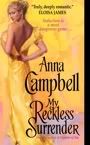
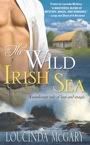
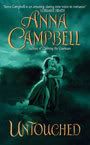
So, here's my first example, and it's our Anna Campbell's: http://www.annacampbell.info/
What I like about Anna's is the prominent cover of her newest book, in this case My Reckless Surrender. You don't have to look for what she's selling. She wants you to buy her newest book and features it. Also, the color and style of the site tells you it's historical but with a dark edgy feel. Anna writes Regency noir books. You know what you're getting when you look at this site.
Here's my friend Jane Graves site: http://janegraves.com/
Can you tell what Jane writes from this home page? Yep, contemporary romances. The colors are bold and eye catching, Izzy her cat adds the element of fun you can find in Jane's books. Jane has her name and newest release, Black Ties and Lullabies prominently showcased. And her photo also gives you that friendly, fun and welcoming feel you get from her books. By the way, Jane's site was created and designed by Jane, herself. Not something I'd recommend for the average author to attempt, but Jane has mad computer skills so it works for her.
Next up is our Bandita Joan Kayse: http://www.joankayse.com/home.html
What is great about Joan's is the banner. Such nice eye candy! You know Joan writes about sexy Romans's and that her website and work are historicals. Since she's waiting for a very smart editor to snatch up her great Roman-era books, this site is important because it advertises Joan and her works to potential editors, agents and future fans!
Here's my critique partner, Jo Davis' site: http://jodavis.net/
Jo currently has two sub genres of romance to advertise. Her website does that successfully. Her name is front and center. You can't miss the books either! The newest firefighter story, Line Of Fire, is larger than the others, which are flashing slowly beside it. The two on the right are her erotic romantic suspenses, the latest, I Spy A Wicked Sin. And the side columns with the sexy men let you know you're in for a sexy good read should you click on the books and order them.
**A side note here. Please note that while there are lots of great critical reviews for Jo's books, they're on the lower half of the page that you have to scroll down to get to. On my tour I noticed many authors putting these at the top or crowding them into the top sidesbars. Remember Suz's rule #1...SELL THE BOOK. The books should always be first! Rule #4 DON'T HURT MY EYES clutter hurts as much as neon!**
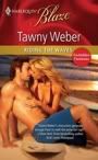
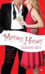
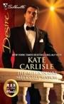
Let's look at Bandita Susan Sey's new site: http://www.susansey.com/pages.php?ID=9
First thing you see is it's light and clean feeling. A contemporary font announces it's Susan's site. Her picture is cute and tells you she's fun. Her brand spanking new book, Money, Honey, is right there for the reader to see and who could resist not looking for what story this great cover holds? The critics' comments and reviews are in the lower part of the scroll, (see the above side note). Great job, Susan!
Here's Geri Krotow's site: http://www.gerikrotow.com
I don't personally know Geri and haven't YET read her books. But her site grabbed my attention and I think it really works for her. Why? See the colors and style of her banner? Now look at the colors of the SuperRomance book she has displayed. She took the colors from the book, muted them slightly and inverted them, mirror imaging what she's selling. Her name is very visible, as is her picture, and the font is contemporary. Great marketing. Does it work? I intend to buy this book just from the website!
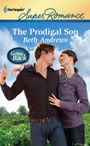
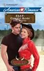
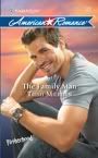
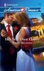
Bandita Trish Milburn addresses a double genre with her site: http://www.trishmilburn.com/
You know Trish writes both contemporary romance and YA romances. She chose to let the browsing reader know this by showing both her adult and YA inner selves on the front page. Her books, The Family Man and Winter Longing, the newest for each subgenre, are on the opening page, not at the top, but not too far down with the scroll! Trish lets her readers know what she's tweeting about in the side bar, but the look and feel of this isn't too cluttered and encourages all her readers to participate in both her subgenres!
Diann Mills is another new author to me: http://www.diannmills.com/
Her site is unique and I think it works because of the theme. There's an oldfashioned map as the background. The personal pictures Diann uses suggests the theme of travel and adventure. Her opening letter and by line talk about adventure. And while her book covers are smaller than those I've shown you on other sites, they're visible at the bottom and it's fun to see them light up as you scroll across them. Think I'll be checking them out, too!
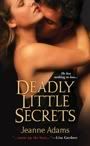
Let's look at Bandita Jeanne Adams updated site: http://www.jeanneadams.com/
First, it's beautiful. The colors are bold, the images sexy and those big guns...well, can we say, BOOM any louder? This is romantic supense, and not much black, a color seen on lots of the suspense pages. Nice use of negative space, great showcase of her newest release, Deadly Little Secrets. Jeanne...A+!
Here's a brand new Bandita site: http://www.inarascott.com/
Inara's debut release Delacroix Academey. The Candidates is a suspenseful YA paranormal book. Doesn't this opening page give you that feeling AND make you want to see what the book and series is all about? I'm betting many a young adult reader and probably their mother will, too! We Bandits can't wait for THIS book to hit the stands!
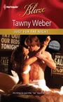
Author Cathy McDavid's site: http://www.cathymcdavid.com/ caught my eye.
Cathy writes for Harlequin American. Her site says American in a big bold way! The colors are red, white and blue, but so are the Harlequin American books! She's got American symbols and sexy images in the banner pictures. Her name is very easy to find, and with a short scroll, there is her newest release. Great job, Cathy!
**And yet another side note. Scrolls. Don't make me work. I might be a reader who is browsing for new books or authors during my 15 minute break at work. Don't make me have to scroll down the home page to find stuff. A home page shouldn't scroll much. No longer than one quick swipe of my finger on the mouse. I'm a big girl, I can click on the page buttons if I want to read all the other stuff you want on your site. And those pages can be longer. Rule #1 SELL THE BOOK.** (Can I get an "amen sister!" on these side notes, y'all?!?)
Okay, I've shown you some of what I like. Now it's your turn!
Take a look at the RWA list @ http://www.rwanational.org/cs/rwa_author_web_sites
and let me know who you think has a great site and why. Also, maybe you can help me. I'm looking for the following things to give as examples to my IT girl:
 1. Sexy, but not porno sexy
2. Western, but no cows please
3. Strong font.
4. Great design or colors
Please copy and paste your favorite URL's in the comments so I can take a look. Tell me why you like it. Why you think it works. What you think will work for me. No negative ones, please! Remember, Bandits don't do snark!
At this point, I'll take all the help I can get, even from that dang rooster!


23 comments:
woo hoo welcome GR to a cold and wet day
Hi Suzanne
Congrats on selling your book. I like easy to read web sites as the eyes are getting older LOL The main information on the home page and tabs for other pages like this one
http://www.carolynncarey.com/
as you say it is all about selling books
Thanks for that tour, Suzanne. I'm getting a redesign for my website and it's overwhelming to look at so many sites for inspiration...your edited list was very helpful. Am drooling over Susan Sey' site...
Way to make it tough, Suz! There are far more sites that hurt my eyes than there are good ones. However, I really like Claudia Dain's website: www.ClaudiaDain.com. Like Claudia, it is colorful, fun, classy and uncluttered. I tried for that with my poor website, but I've been letting it die of neglect. Logging into WordPress and updating the home page is far too much work for my stressed-out brain!
That's another thing: websites need fresh content (unlike mine). For authors with books coming out, book signings and appearances, updates are an expectation. I'm just glad almost no one peeps at mine. It's slightly horrific!
Our blog is so non-chatty when all our lovely Banditas are out of town. *pout* I know they are having fun, but what are we supposed to do here, all alone? *sniff*
I suppose I'll just go to the Dreaded Day Job! *sob*
Well done Barbara and he has just visited my place while we both are learning about e book readers we both have just bought one all ready for the release of your book Suz YAY.
I am so bad a designing and choosing colours but I do like the web sites you have picked and the Bandit ones I visit often. I too like one that has all the main information on the first page with headings at the top for other places that I like to look at this is Paula Roe's web site and I like this one because it is easy to navigate and has all the infromation I need.
http://www.paularoe.com/
Enjoy choosing you we page Suz
Have Fun
Helen
Great post, Suz. I enjoyed virtually "thumbing through" the different websites. Have to say again that I ADORE Inara's website and LOVE Jeanne's bold colors.
Congrats on the rooster, Barb. I guess he found his way back from Orlando, the naughty bird!
Congratulations again on finding a home for Lacy's book, Suzanne!
I'm really impressed by how you've analyzed your website design so thoroughly. Makes me want to take another look at my own!
Yes, Posh, it's disquieting how silent both the loop and the lair are. Makes me want to hum the Twilight Zone theme.
Way to GO on capturing the GR, Barb!
I think he is happy to have a cold wet day... well, maybe not wet. ;-)
Thanks for all the GREAT links Suz! It is always fun to see what other authors do on their websites. Like Posh, I found far more I didn't like when I was looking for ideas for mine. It's that old saying about art, "I don't no much about it, but I know what I like."
AC
Posh and Jo-Mama,
I guess we shouldn't have allowed so many of the cabana boys and other staff some vacation days along with the Banditas who are off to National. :-P Even though there is not much work to be done around here, it is WAAAY TOO QUIET!
I say we have an ice cream party! Banana splits anyone?!?!
AC
Timely post! Like Suzanne says, some are great, while others are too elaborate and difficult to navigate. Too much window dressing screaming for my attention confuses me. And remember that anyone can view the contents of your blog and if you post a pic, make sure it's a good one. (I've seen a few photos that were kind of "boudoir" - I'm cringing.) My CP is blogging on another site today about building your own blog. I'm thinking about putting up a blog, but I'm still too chicken.
Here's my CP's site. It suits her to a T. www.smartassromance.com
The deck guys are here sanding the back deck. The entire house is vibrating and the cats need Valium. So much for quiet!
Good idea, Aunty! My banana split
ingredients are a bit different. I
use the regulation banana, whipped
topping, pineapple sauce, chopped
nuts, and cherry-on-the-top. The
ice cream I use is sherbet, either
the rainbow or citrus rainbow type.
My crew thinks that's weird,I think
it's delicious!
Pat Cochran
Here are some I like. They are different from one another. Some have lots of bells and whistles; others are more basic. Some have volumes of extra stuff; others have very little. But all of them make it easy to find information about the author’s books, current and backlist. I visit the site in search of this information, and I don’t want to have to watch videos or slide shows to find the book info. Another thing I like about all these is that they all fit the author. They don’t make me feel as if I’ve wandered into the wrong “house.”
http://www.eloisajames.com/
http://www.juliaquinn.com/
http://www.jobev.com/
http://www.lisakleypas.com/
http://tessadare.com/
http://www.annegracie.com/
http://www.marybalogh.com/
http://www.julieannelong.com/
http://www.juliejamesbooks.com/Site/Julie_James_-_Author.html
http://www.christinadodd.com/
http://www.deannaraybourn.com/
http://www.candicehern.com/
Great list, Janga. Those are some of my favorite authors!
Banana splits, Cindy! I'm so all over that.
Oh, Pink, I hate the boudoir pix. Especially when they're clearly 20 years old. Not that I recommend full disclosure necessarily, but still . . .
WTG on tailoring your own banana split, Pat! Sounds good to me.
Hey Pat,
I think your sherbet banana split sounds GREAT! I LURVE orange sherbet and pineapple is a very close second. SLURP!!! Pass the whipped cream and choccie sauce!
AC
Hey Pink,
Thanx for the link to your CP Carrie's blog. She's LOL funny! And I LURVED that recipe for Sangria Sipper. Wait til Joanie hears about it! ;-)
AC
Wow, Janga!
That is quite a hefty list of authors... oughta keep Suz outta trouble for an hour or two. :-)
AC
I meant to say, congrats on nabbing the GR, Barb!
Also, I am SO with Suz on the websites that hurt your eyeballs. The worst are the ones with glaring colors that are horribly cluttered. Ack!
Cindy, if we're having banana splits, I want all vanilla bean ice cream - three scoops - each with a different sauce. Hot fudge on one, caramel on another and strawberry on the third. I also want whipped cream, but I want it freshly made.
Where are those cabana boys with the hand mixers when you need them?!
Janga, I ADORE Deanna Raybourn's website. I just wish they would publish more of her Lady Julia Grey books. I loved those!
Post a Comment