
by Anna Campbell
One of the best bits of having a new book out is seeing the cover! Well, it is if you've been blessed the way I and other Banditas have been blessed by the cover gods (very capricious deities who must be placated with much worship and regular offerings of Tim Tams).
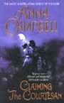
A couple of weeks ago, I got the final version of the cover for my 27th October release, CAPTIVE OF SIN. And I can't wait to show it to you.
I just LURRRRVVVVVE it. So much going for it. I think he's really handsome. I think she's really pretty. It's not cheesy at all. The stepback picture says something about the relationship. Why? Well, you'll just have to read the book to see but the two of them looking at each other longingly certainly fits.
It's one of those half covers - there's a fashion for them at the moment. So the picture of the hero peeks out in a come-hither way from the stepback (I'd come hither! Hither me now, mister!). The white is textured with twining roses and it's a lovely pearly color and the red is foil and really stands out against it.
 I'm absolutely delighted, as you can imagine!
Covers are such an important part of a romance novel - obviously not as important as the deathless prose inside but still highly significant. I actually like a clinch cover if it's well done - not so keen on girlies on their knees looking up worshipfully just before they you know. Especially when those covers always seem to be set in unlikely places - the deck of a tossing ship or on a rock near the sea where the protagonists are about to be swept away and I don't mean by passion.
One of the reasons I like a clinch cover and why I think they've never gone out of style, in spite of how people whinge that they're clicheed and embarrassing, is that they scream romance. You know just what you're getting when that hunk and that willowy chick are clutching each other on the front of a book. My mother always made me laugh. She used to call it the girl in the nightie and the man with the flowing hair and the bare chest. The flowing hair isn't so big anymore but, yep, I'd say the nightie and the lack of shirt are still there. Six packs rule!

All of my covers have been clinches. Great clinches! Even TEMPT THE DEVIL which featured the gorgeous and omnipresent Nathan Kamp's face on the cover had a clinch on the stepback. A clinch by the seaside, but at least they're both upright and well above the waves. I'm not really expecting them to be washed away unless there's a tsunami some time soon.
So I started thinking about recent covers I really liked. That's always fun - much more fun than polishing a manuscript! What's unexpected is none of the covers that really took my eye lately are clinches. By the way, Bandita covers are exempt from this survey - gorgeous as they are!
My first selection is almost as omnipresent as Nathan Kamp. I think the cover for TWILIGHT by Stephenie Meyer is an absolutely brilliant piece of marketing. The rich colors, the pale arms, the red, red apple like something out of a fairytale. Yum! It's simple but it's so effective and evocative. Another apple cover I think is really clever is Jennifer Crusie's WELCOME TO TEMPTATION. Back in the year 2000 when that book was published, that cover was revolutionary with its simple apple with a bite out of it on a plain red background.

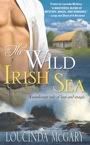
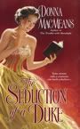
Another set of covers I think are really great are Nicola Cornick's BRIDES OF FORTUNE trilogy, out June, July and August this year. Nicola's a lair favorite and I love her books. But even without knowing that, I'd pick up these three beautiful books with their rich colors and elegant images. Speaking of fashions in covers, people chopped off at the chin or the nose seem to be the thing at the moment. But I think these are particularly nice examples. I've only got room for THE CONFESSIONS OF A DUCHESS with its intensely red dress on that lovely patterned wallpaper background. But check out the other two, THE SCANDALS OF AN INNOCENT and THE UNDOING OF A LADY.
My favorite recent cover, though, is for a book by another lair favorite, Eloisa James. I think this cover for THIS DUCHESS OF MINE is breathtakingly romantic. Eloisa always gets lovely covers but on this occasion, the Avon art department excelled themselves. That soft pink really takes my eye - especially in a sea of more overtly sexy images.

So what conclusion have I reached after this lightning survey of recent covers? There are obviously certain things I like. To my surprise, it's not half-naked hunks although I must say they're pretty appealing too. But when I'm picking favorites, I seem to go for apples (who knew?) and headless women in pretty dresses. Not the answer I thought I'd end up with at all!
Oh, and I absolutely love my covers especially the CAPTIVE OF SIN one. Which features neither a decapitated chick (hide your eyes, rooster, I know you hate to see 'chick' and 'decapitated' in the same sentence) nor a piece of fruit. Perhaps that can count as my shirtless hottie selection.
By the way, you can find the blurb and an excerpt from CAPTIVE OF SIN (including another chance to drool at the pic) on my website.
So what do you like in a cover? Love or hate clinches? Love or hate the headless brigade? Do you have a favorite cover? Let's talk romance novel covers!
I'm flying to Washington D.C for RWA today so probably won't be in much but I'll get back to answer comments as soon as I can.


53 comments:
Moi?
Ha!
ChaCHING!
Hmmm. Anna's on a plane right now I'm guessing...or about to board. Fly safe Anna!
Lessee..I admit that I like covers to be a little more abstract, and as a rule, do not like clinch covers. There are a few exceptions. Jeanne's cover for Dark & Dangerous--that's the kind of "clinch" I like. It's edgy and sensual. Claudia's Courtesan's series are some of the best covers I've ever seen, and yes, Anna, I think Nathan on TTD is, literally, breathtaking. It's that look in his eyes. And I like it much better as the stepback, so I can carry around just HIM, and only look at the clinch if I want to.
I like all kinds I guess. Some of Sherrilyn Kenyon's Dark Hunter covers have left me speechless. I just stare at the expression and can't look away. Hmm. I'll have to think on this cover thing. I'll have to take a cruise around my shelves and see what grabs me.
Lovely topic, Fo. I always thought "clinch" covers were spelled "clench" covers. I mean, the hero and heroine are in a clench, aren't they? "To clinch" is to secure or fasten, but "to clench" is to grasp firmly. How could I have gone so far astray? Just goes to show you!
Anyway, I've always loved the more subtle covers, so the half face works for me as though there's a mystery about the character, male or female. I've never been one for heaving bosoms or bare chests; covered is so much sexier I think, but I have to say, darling Fo, your latest cover is delightful!
Thank God, the rooster's gone. The cats and I can go to bed now. Cassondra, you're a better and braver man than I.
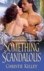
First, I don't like photographs on romance covers, especially not a face. For some reason, a photo skews with my imagination, while a painting doesn't. I'm not terribly keen on cheesy male torsos that take up the whole cover. There's got to be SOMETHING else on the cover besides a half-naked guy. I'm fine with clinches for historicals, but don't like them as much on contemporaries. I really love covers with women in beautiful gowns. Agreed re Eloisa James's latest cover. Simply gorgeous. I like the cover of Christine Wells's Wicked Little Game because the girl looks sooooo devilish. Such a come hither mwa ha ha look that you can't help but open the book :))
Oooh, fun topic! I don't hate clinches, but I don't love them either. Some work, others don't, and I try to focus on the book itself in the latter case. And I'm totally with Barbara on the picture/painting thing. As for the headless brigade - if the girl's dress is nice, I love it, but if not... my bad example would be Joanna Maitland's His Forbidden Liaison, because there's something wrong with the dress the girl's wearing and the lack of heads just accentuates the issue.
One thing that really irritates me, and which I've seen a lot of lately, is covers with overlaid patterns. All three of Joanna Maitland's Aikenhead Honours books suffered from this, and I just don't get it. It makes the people on the cover look like their have rashes or something.
I'm in love with the covers for Tessa Dare's upcoming trilogy - not only are the beautiful, they match the feel of the stories perfectly. Well, the first two do, at least. I haven't read the third book yet. And I love Harlequin when they get their covers right - the original trade paperbacks of Maria V. Snyder's Study series are GORGEOUS, and Deanna Raybourn's Lady Julia Grey series, especially the Silent in the Sanctuary covers, are stunning. Robin McKinley's also gotten some great covers. I especially love the feel of the Chalice and Sunshine covers - the two works are soooo different but both covers fit them perfectly.
Cassondra, congrats on the rooster!
Oh Anna, I love your new cover! I think covers are very important. The covers is what draws my eye to a book and I love most historical covers.
never thought about clinches but guess they are ok, I am more on the I hate when they have no faces brigade. I want to see faces not just cut off necks. Still they are sure pretty still without those heads.
Can't name just one covers, there are too many pretty ones out there
Congrats on the GR, Cassondra.
Hi Anna,
Have a nice flight. I love the cover for "Captive of Sin." It's so purty. I really like stepback covers and Stephanie Laurens' and Jacquie D'Alessandro have gorgeous ones. I also like the silhouetted covers seen on many of the romantic suspense books.
Congrats Cassondra enjoy your day with him
Anna this cover is beautiful I too love it.
I love covers with a male and female on them even with parts cut off I really love stepbacks as well they give me a better picture of the characters in the book I am about to read.
I am not a fan of the Twighlight cover when I first saw it in the shops I wouldn't have picked it up, and agree that Nicola's covers are lovely the Australian release of Confessions of a Duchess I really like (I am reading this at the moment and loving it)it has 3 regency ladies on the front and it drew me in as soon as I saw it.
Anna have a safe flight
Have Fun
Helen
Hi Anna, very excited about the new release being on my birthday! If it's half as hot as Tempt the Devil I'll have to read it in front of the fan so I'm glad the weather will be warmer here in sunny Queensland. Have you seen the Australian cover yet?
Covers? I'm one of those people who constantly buy books because I love the covers. I confess that of course there is nothing like a 'hot' male on a cover, I also love the headless historical covers with the gorgeous flowing dresses. I have heaps of them too.
I like textured covers even if it's just foiled lettering. Clinches? Depends on the clinch cover. The headless brigade drives me nuts. If i say I like a cover that has a headless figure on it, it usually just means I like what they're wearing. I prefer bottom-half-headed covers to ones that are cut-off at the neck but even those kind of bug me. I also prefer covers where the person/people aren't looking directly at me...well, unless it's a really hot guy...then I'm okay with that...Heh!
At the moment, I'm drawing blanks on a whole lot of covers but some I've recently come across that I really liked include Maria V. Snyder's Poison Study(TPB) and the covers for her Glass series, Deanna Raybourn's Silent in the Grave(MMPB) and Silent in the Sanctuary(TPB) and Carla Kelly's Marrying the Captain(I was trying to cut back on book-buying but I loved the colours so much that I caved and bought it...and then I was given a second copy...doh!)
Oh, Candice Hern's Merry Widows Trilogy was the first time I noticed the ladies dressed to kill without their full faces showing. All of those particular covers are paintings. Very beautiful. I don't mind the clinch covers I am like Lynz, just kind of in between. I really do like the step backs.
I love clinch covers. I WANT a clinch cover for my book!
Love your cover. Loved that EJ one too, sooooo very much. HQN historical makes some beauties. Julia Justiss had the most beautiful covers (the Courtesan comes to mind).
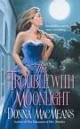
Fave covers of all time were Louisa Burton's House of Dark Delights and Bound by Moonlight.
Recent cover... well I really like the cover of "Dont Tempt Me" by Loretta Chase and Carolyn Jewel's Scandal.
Covers are important for me but no so much for historicals.
Hi Anna, lovely blog. It is a fantastic cover, and as someone who has seen it 'in the flesh', I think it's going to pop even more when it's on the shelf.
I think my latest cover is one of the few that has the heroine's face on it (where there is a lone female on the cover!) I tend to prefer the ones that feature a beautiful dress. I think that blog of gorgeous colour really makes the cover stand out. I also like some of Liz Carlyle's earlier covers--The Devil to Pay was a great one. For myself, I like any cover that sells the book! I always say that if you have a choice of aesthetic charm, something that really portrays the book or something that will sell, take the selling cover every time. Of course, it would be wonderful to get all three!
Hmm, that was 'block' of colour, not 'blog'. Clearly, I have blogging on the brain.
I love clinches! I love when historicals have the gorgeous woman decked out in a beautiful ball gown...EX= Julie Anne Long's Since the Surrender and No Other Lover...Loretta Chase's Don't Tempt Me..Jane Kidder's Something So Right...
I love the KISS! EX=
I dislike inanimate objects like a martini glass or a red shoe. I dislike The recent number of covers with ladies wearing a man's white shirt with bare feet. Rachel Gibson's was one of them.. I can't remember the title But I love her books.
A pretty scene can be OK. Toni Blake incorporates both a scene and a kiss in Letters to a Secret Lover, a kiss inTempt Me tonight and a restful scene in One Restless Summer.
I don't go for cut off heads..Ex Meg Cabot's Queen of Babble in the Big City focus is on legs in white high heels.
Fo, I LOVE your new cover! I so can't wait to have my very own copy of Captive Of Sin *g*
As for covers, I'm partial to clinches (as I should be seeing as how my covers have all been clinch covers *g*) and I really like all the historical covers showing the heroine's back (such as Christine's Wicked Little Game!) or legs peeking out of a gorgeous gown :-)
OOPS!! My kiss examples got deleted!!
Janice Maynard's Mating Game, HelenKay Dimon's It's Hotter in Hawaii, Your Mouth Drives Me Crazy, Holding Out For a Hero and Right Here, Right Now.
Totally agreed on the block of color thingy. I'm always drawn to large swaths of bright red, green, blue, or purple... And amen on what sells, or at least gets people to open the book. I blogged on a similar topic not long ago and was amazed to see the range of tastes.... from those who buy a book because of a male torso to those who won't even pick it up. Heh. I do so love the variety in the human race.
Hi Anna,
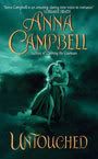
Love the cover for your next book. I have to say that I am a bit behind reading your books (hanging head here). I have Untouched & Tempt the Devil on my TBR shelf but haven't gotten them out to read. Don't know why...anyway, point of my comment: There seems to be a lighter note to the covers for TTD and COS. Are they considered to be the regency noir like your first 2 books?
I think my all-time favorite covers were those on Candice Hern's Merry Widow Trilogy. Those covers were just beautiful. I love those clinch covers too!
Just wanted to say LOVELY COVER!! You're moving on up, lady. LOL!
I like the chopped off faces and heads but I think I'm in the minority in that. I prefer something on the cover that really represents the story so clinches aren't for me. There is more to Romances than clinching, but I'm of the old school McNaught covers that had a small jewelry box or something like that that brought out a detail about the story. Made it feel more like the people designing the covers had bothered to read the book.
Anna - Your new cover is gorgeous. Do you make offerings to the cover gods?? Love it.
There was a trend a while back on historical covers to show backs. Lisa Kleypas (Mine till Midnight?) comes to mind with the beautiful blue dress. I liked those. I love the painting covers for historicals, rather than photographs - it works for the genre. Beautiful dresses? Oh my yes! Love those.
A good cover is so critical to the sale of a book, so glad you got a great one.
I only have one gripe about romance novel covers - When the cover does not reflect the genre.
I've seen so many historicals that look like contemps . . . I wonder if the art departments are paying attention sometimes.
So bring on the covers, be they cliché, headless, bear-chested men, landscapes, etc. Just PLEASE hint at the genre - and let no zippers show before their time! LOL
:D
G.
Great points everyone -- add me to the list of folks who do NOT like photos on their covers. This goes for all genres. I want to imagine the hero/heroine. I don't want someone showing me exactly what they look like. I dislike video trailers for books for the same reason. I watch movies and read books for different reasons.
I must admit, I'm not a fan of the clinch. When I read a book on the plane or bus, I don't want to feel awkward about my boss seeing the cover. KWIM?
Anna, I adored your first two covers -- they were so atmospheric and sensual. I like the stepback but the green monster was my favorite!
And I must say Christine's latest is one of my favorite covers ever. That heroine has such a fabulous expression. So naughty and yet so innocent. Love it.
Genella, I'm with you. The misplaced zipper drives me crazy! I love Eloisa's covers for that reason.
Cassondra, I agree with you on Claudia's covers. They've been some of my favorites. I guess I'm a sucker for the lone female cover. Who knew?
Cassondra, chaCHING! indeed. *g* I hope you'll keep him busy. Perhaps put your talents and the dh's to confining him through next Sunday so he can't embarrass the Lair in DC?
I second your good wishes for Anna C.'s trip. I don't know whether she's flying over the Pacific or over Europe, but I'm sure she's over something right now!
What covers do I like? Hmm. Warriors, male or female, with swords. I do prefer that they have heads. Headless torsos move books, I'm sure, but they always leave me wondering what's wrong with his face (or hers), that it couldn't show.
I'm not a big fan of clinch covers, but I do love clinch stepbacks. Don't like reading the clinch ones in public, like on planes.
Knights in armor get me to pick up the book and read the blurb. For that matter, so does a lone sword on an intriguing background. Very Excalibur-ish.
A picture that smacks of magic in some way draws me in.
Action - like combat of some kind - gets me to look further.
I guess I have fairly eclectic tastes.
Cassonndra, good point about the cover for D&D2. It's a sexy clinch but not in the stereotypical sense. Carrying it around didn't bother me.
Lynz, Maria Snyder does have gorgeous covers, doesn't she? Many of her books are too dark for me, but I'm thinking this newest one might not be.
The Deanna Raybourn covers are nice, too, despite the headless bodies. I like the mass market edition covers better, though. Very atmospheric, too me.
Pissenlit, I like the foil, too. :-) Also the Snyder and Raybourn, especially the mass market editions of the latter.
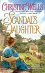
Christine, all your books have had gorgeous covers. The one for Scandal's Daughter is wonderful. Her face may not show, but it conveys her loneliness, her being apart from Society, beautifully.
*Squeals in excitement* Yes! If the cover is ready, that means the book will be out before long! *Pants in anticipation* Whee!
I have to say, generally I'm in the headless brigade. So many cover models, however hot and hunky they are, don't match my image of the guys in the books. BUT Anna's covers -- this one and TTD -- are exceptions. Great-looking guys who I can envision in the story, even when I don't KNOW the story (as with the new cover).
With contemporaries especially, there are a lot of cover pictures that turn me off the book. It won't stop me reading a book by an author I like, but it certainly wouldn't tempt me to buy it.
I also think that Eloisa James cover is gorgeous, and the belly dancer featured here a day or two ago was also very lush. Too busy to stop and search for other favorites, but I just had to check in!
I love your new cover, Anna! Beautiful! I'm a bit of a cover fanatic. I will buy books solely based on the cover art, lol. The more appealing to me it is to me, the more likely I'll buy it.
I know, I know, don't judge a book by it's cover--but I can't help it!! I LOVE THEM!
CoS is my favorite cover of yours. It's gorgeous! The cover gods are very awesome to you. Yay! Congrats! And I hope you had a safe flight over here.
Nancy: yes, come to think of it, I can see how Yelena's past could be a bit dark. Just a teeeeensy little bit. *giggles* As for the newest one - I'm assuming you mean Storm Glass - it's not as dark, no, but it's also not nearly as good as the others. At all. Though that's just my opinion.
As for the Raybourns... I so like the headless version of Silent in the Sanctuary but can't stand the headless picture they used for Silent on the Moor. But I do have to agree that the mass markets are the best.
And I have to agree with all in favour of foil as well as all annoyed by misplaced zippers. Tsk, tsk, lazy art departments.
Kirsten and Nancy, thanks for the compliment about my covers. I've been very lucky!
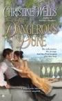
Actually, if anyone is interested, there's a full page on cover cafe that explains how my cover artist, Jim Griffin, does covers (in particular, THE DANGEROUS DUKE)
http://www.covercafe.com/BTSCBgriffin.shtml
He has illustrated all 3 of my covers but WLG is very different from the first two. They were going for a tastefully sexy look and I think he did a great job.
I like a lot of contemporary covers--the ones that look fresh and sassy. Loved American Diva. Thought that cover really stood out. Kandy Shepherd's LOVE IS A FOUR-LEGGED WORD is retro and different.
Anna, I think you're right about the cover capturing exactly the right mood for CAPTIVE OF SIN. Having already read it (yes, for the 500th time, I am gloating that I get to read Anna's books in ms form!) I think it's absolutely perfect. And the bare chest that peeps out when the book is closed is pretty darn eye-catching, too!
Christine - Thanks for that link, it was fascinating! I never made the connection that the same artist was doing a lot of those beautiful covers. It was fun to see how your cover was put together! I love that Denise Rosetti cover, too -- I have that book in my TBR pile.
Sounds like the rooster kept you very busy, Barbara, and don't worry, Cassondra can handle him. She's got all those, uh, you know, weapons should he get out of line.
I agree that photos mess with the imagination.
Becke, the cover Jim did for Denise's book is one of the best I've seen and so evocative of the book. I think he actually read it, or at least a partial of it, which makes a huge difference. Glad you found it interesting.
Admittedly, I'm not huge on clinches. I really like artistic covers, and ... I don't know. I'm not for the covers that scream "trashy romance" - because you *know* that's what people think when they see them. Why encourage that?
I have to admit the Twilight books are *very* eye catching. :P But I'm not tempted to read them, based on what I know. Some super artistic covers will entice me to pick up the book though, so it all depends.
Congrats on the GR, Cassondra!
Anna,
You definitely have an "in" with
the cover deities! Your covers have all been of the "reach out and grab you" style. Love the newest!
I agree about the James, Justiss,
Hern , Cornick covers. In fact, there aren't many historical covers
that I haven't liked.
Pat Cochran
OK, OK, I know, I know. I'm late, I'm late for a very important date! And you all had such a party without me! Thanks for turning up even if the hostess was missing in action! You guys are the bestest.
Hey, Cassondra, it's a while since our wee chooky has visited you. I hope he was a good boy.
Hmm, checking the comments, I'm gathering clinch covers aren't universally loved. I think I like them because they scream ROMANCE at me. Maybe becuase it's because they remind me of the 70s, when I started to read these books.
I agree about Deanna Raybourn's covers. They're SOOOO striking. Sort of a modern take on the gothic classic.
And I also love Stephanie's covers. The Australian ones for the trade paperbacks are even prettier, in my opinion. Really classy. Clinches don't really go over in Australia - not sure why. Perhaps we don't have so much of a 'romance' culture. Eloisa has had some gorgeous covers here too - the trade paperback for Desperate Duchesses was absolutely amazing.
Alaine, no Aussie cover yet. I'll let you all know when it comes. The Aussies really liked the gothic look for the first two and went for that for Tempt the Devil. I suspect Captive of Sin might be something similar. Laughed at you reading COS in front of the fan!
Christine, I love Liz Carlyle's covers too. I wanted to include them in the blog but it was getting too long. Beautiful colours. I actually think I really respond to rich colours on a cover - it seems to say here's a wonderfully delicious historical.
Karen, what an interesting comment about the two most recent comments. I think they're still considered Regency noir but Avon were going for a BIGGER look (at least that's what they told me). I find the thinking of visual people really interesting! And of course, both Tempt and COS will have a stepback so you get the clinch anyway, you just have to open the book to find them!
Hey, and no need to apologise for being behind on your reading schedule. You should see my TBS pile which is full of goodies and sadly, I'm still adding to them ;-)
Hello, my name is Anna and I'm a book addict!
Genella, definitely NO ZIPPERS!!!! ;-)
I'm really enjoying seeing the range of responses to this question. I mainly read at home so the embarrassment/clinch conundrum doesn't affect me. But I do know what you mean!
Hey, thanks, guys for saying you love the new cover. And seriously, as Chrisine says, it's even prettier in the flesh (especially HIS!). I just love it. Ely, I think it might be my favorite too. And it really reflects the story - although you'll have to read the book to find out if you agree with me!
Oh, and I find photos offputting too. I'd much rather a painting.
Honestly, yet again, I can't thank you all enough for coming by on day when I just couldn't get to a computer. I had a horror flight - now, that's material for a future blog - I nearly ended up in HOUSTON!!! In fact, Houston, we had lots of problems! I finally made it but haven't really had much internet access since, hence the late replies.
THANK YOU!!!!!!!!
Post a Comment