by Christine Wells
So here's what happened for my Scandal's Daughter cover. These are the first images I came up with:

 I had in mind a romantic but not overly sexy clinch, perhaps the couple waltzing.
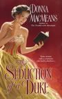
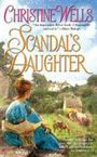
 I also found covers I liked that showed a heroine and a house. Look at the Almost Innocent cover
  and then look at mine. Do you think the art department paid attention to my suggestions?
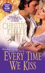
 I love my cover--it's so pretty! Can't wait to see what they do for The Dangerous Duke!

Hi all, I'm swinging by to fill in for our Bandita Kirsten who isn't well today.
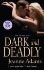
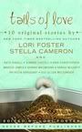
My friend Denise Rossetti came over the other day, bubbling with excitement about her upcoming cover conference at Berkley for her Four-Sided Pentacle series. Incidentally, here is the cover for her Avon Red short story collection, A Red Hot New Year--isn't it HAWT?!
My friend Denise Rossetti came over the other day, bubbling with excitement about her upcoming cover conference at Berkley for her Four-Sided Pentacle series. Incidentally, here is the cover for her Avon Red short story collection, A Red Hot New Year--isn't it HAWT?!

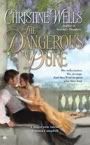
It got me thinking--hmm, won't be long until my cover for The Dangerous Duke comes up for discussion. Better avoid my WIP, er, I mean, do my duty, and find some images to suggest for my cover.
Now, it's a commonly held belief that authors get no say in their covers. That's true. Once the cover is done, you have to have the clout of someone like Stephanie Laurens to get it changed.
But when my editor asked for suggestions, I had a Word file of pictures I'd copied from the internet to show her and the art department my ideas, what Sebastian and Gemma looked like, the settings I'd used for each of their homes and some of the scenes in the book. I'd also spent hours going through covers until I found ones that captured the mood of Scandal's Daughter.
"Show, don't tell" is a good policy in this case. As writers, we deal in words, but it makes sense that an art department thinks in terms of images. It's so much better to show them the kind of cover or the kind of mood you're looking for, rather than tell them. They might come up with an entirely different vision from the one you intended just from a verbal description.


So here's what happened for my Scandal's Daughter cover. These are the first images I came up with:
 I had in mind a romantic but not overly sexy clinch, perhaps the couple waltzing.
However, my editor saw Gemma on a horse, riding about the estate. So I found images of period riding habits as well as images of women riding side-saddle in habits very similar to those worn in the Regency.
 I also found covers I liked that showed a heroine and a house. Look at the Almost Innocent cover
  and then look at mine. Do you think the art department paid attention to my suggestions?
 They also got my heroine's hair colour right, which I think is SO important! I was delighted with the result!
 I love my cover--it's so pretty! Can't wait to see what they do for The Dangerous Duke!
So, dear readers, what do you like to see on a cover? Any turn-offs? Have you ever bought a book purely because of its cover?


32 comments:
I like to see a picture of the hero and heroine together so as I can get a picture of them in my mind I also really like covers that have a step back. I always look at the covers of course but in saying that the cover is not what makes me buy the book. I have hundreds of books with all different types of covers from flowery ones to beautiful heros and heroines in wonderful poses. A cover doesn't influence me to buy the book the author or recomendations from people are what makes buy it.
Have Fun
Helen
Christine, great post! And thanks for stepping into the breach, Bandita! What is a day without a new bandits post, I ask you!
Can I say again how much I like SD's cover? It's so atmospheric and it's got a lovely English feel.
I like all sorts of covers but I find it really annoying when the cover has nothing to do with the story. Blonde when the heroine's a brunette, for example. A passionate clinch under a waterfall when the story doesn't have anything like that. I like clinch covers! I know they're not PC but to me, they scream romance. I suppose it's because all the romances had those covers when I started reading them.
And haven't the Banditas been lucky when it comes to covers?
Hey, can't wait to see your next cover! Bet it's fantastic!
Kirsten, hope you feel better soon.
Hi Helen! Great to see you here! And you get the Golden Rooster for the first comment of the day.
I like to see hero and heroine, too, but not their faces. I'd rather imagine them myself.
Thanks for commenting!
I forgot to say that a couple of the best covers I have seen are Anna Campbells covers the are really beautiful and I agree with you Christine about you cover I really liked that as well Donna's cover is another really good one very seductive. I think you can get the feel of a book by what the cover is like.
First post two days in a row for me lucky me.
Have Fun
Helen
Thanks, Anna, yes we banditas have been lucky with covers! It can be so frustrating for the author, though, when the details are wrong. That's why I think it pays to have everything ready to go as soon as you're asked. Of course the art department might well ignore me--they know best, after all, and I'd love it if they surprised me with something utterly exceptional--but at least if you prepare beforehand, you know you've done everything you could. The rest is in the hands of the cover gods!
Thanks, Helen. And congratulations on getting the golden rooster - even if he did sleep in this morning!
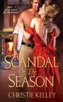
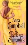
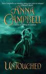
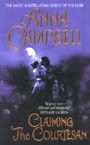
One of the many things I like about my covers is that they really express the story and the character relationships. In CTC, he's trying to compel her to surrender to him and she's giving back as good as she gets! You can tell they're both really strong willed and there will be fireworks before the end. In Untouched, he's such a heroic protective type and that's exactly what he's doing. And the cottage setting at the back of that one is precisely right. Christine, I was delighted when the coloring was right for the characters too. I know it's a small thing, but that physical detail really matters to me. Fingers crossed the next one is just as evocative.
There have definitely been covers that made me pick the book up to see what it was all about. However, it is the blurb, the author's name, or something on the intro page that makes me actually buy the book. I love covers with the hero and heroine on them in a pose that perhaps tells me what the relationship might be. I also love atmospheric, period type covers. Yours is lovely, Christine. Stepbacks are terrific as well. One of my prizes from the Avon FanLit event was one of the original paintings of the cover art for Stephanie Laurens' book Beyond Seduction. It is a beautifully framed oil painting. Gorgeous. I met Ms. Laurens at a book signing in Birmingham not long after it arrived and she told me there were only three copies of the painting - hers, mine and the artist's. It hangs in a place of honor in my writing studio next to my framed, autographed copy of Anna C's Claiming the Courtesan coverflat.
Covers - mumble,mumble, groan groan and throw in a expletive or two. Hmph! Don't get me started on covers!
I've liked 1 out of 10 so far. I live for the day I get a say.
But anyway, seeing as how you mentioned Denise, Christine, how about THAT cover? Gift of the Goddess. Now that is some artwork.
And yes, I quite like not seeing the H and H's faces. It allows your imagination to run wild.
Amy
Thanks for filling in at the last moment, Christine. And yes, YOUR cover is delightful.
Too sexy, bare-breasted women and Fabio-type men actually turn me off on covers. But I DO pick up a book based on the rich colors. I like a vibrant, exciting cover, but I'd never by a book on the cover alone. I have to read 2-5 pages before I decide if I'm going to like it.
I don't mind NOT seeing the protagonists on the cover. When my visual image suddenly conflicts with the description I read, I just do a quick change over LOL.
I agree about Denise Rossetti's cover. Fantastic! I like it when the cover represents the book like that. It's an erotic romance so seeing a bit of torso there is appropriate, but it wasn't over the top. I hate it when a cover shows nothing but a man's rippling abs - it doesn't tell much of what the book is about, except sex. I like to see a bit of hair colour too and some context, like a house. Or a really nice tattoo :)
It's disappointing when you expect a certain something from a book based on the cover and it doesn't deliver. I thought it interesting you mentioned hair colour Christine. So often there will be a dark haired man on the cover and then you discover the hero inside is blonde. What's up with that?
Hi all,
Chiming in late as per usual on a work day. Wasn't too bad so can't complain.
I am with you Anna. Clinch covers are my favs. If not an actual clinch then one of the sexy hero...not so much the heroine but a bare chested hero.
I'm a classic romance buyer..cover first then back blurb THEN I might read a few pages before I decide and go plunk down my Borders card and say "ring me up!"
I have some GREAT cover ideas for my Patricians :-)
Hey Christine, thanks for the mention. And Amy, mucho sympathy. I know I've been incredibly lucky in my covers.
I agree with Sami, I like the cover to be genuinely representative of the contents, but I REALLY don't want to see the faces. No model could ever live up to the mental images I have of my heroes!
The cover for A RED HOT NEW YEAR is just right for an anthology of erotic stories. It's sassy and sexy, but no sleaze. I LOATHE sleaze!
As for the cover of GIFT OF THE GODDESS, I look back at my first reaction and laugh at my silly self. I wanted this changed and that and the other. Duh! Talk about picky! Now I realise that cover has sold any number of the book. I've never seen a woman look at it without going PHROARRRR!!! or some personal equivalent.
But you know, they did actually listen. I asked for a man with swimmer's muscles rather than a body-builder's and that's what I got. I call him Mr Gorgeous - because he just is. :-)
It's here is you want to see it - http://www.deniserossetti.com/gift.html
Click for a larger image. And as you see, I use it as my avatar.
I also have it blown up to poster size on the wall of my study and it gives enormous pleasure just to look at it. Of course. *smile*
Denise
Hey Christine,
What a wonderful post--and for a fill-in post you're amazing! Girl, you can fill in for me on my regular day! ;0)
I love your thoughts about sending art to the art department, giving them a feel for the mood of your book. That's very interesting to see what you sent and then what they did with it. It must be a daunting process from their end of it--having to represent a book and yet do something different and hopefully enticing for each book when they have to do so many!
I admit that I don't like covers with barely a barely covered couple, full-body, in the midst of the mattress dance. It's not the image that I don't like, it's walking around with that book to read in a doctor's office or a business environment while I'm waiting for an appointment--falling out of my bag when I'm in an interview or with a potential client.
I know the truth--that the book is a good one--but the stereotype bothers me. Gosh. That's terrible, isn't it? That I fear being seen as unprofessional if I'm reading something that appears to be erotic?
I LOVED the double covers with something a little more intriguing on the outside flap, with the full-blown romance cover on the inside. Those are expensive and rare, I know. I think, all in all, that the Banditas have been blessed with great, tasteful covers.
Denise, I LOVE the Red hot new year cover. I think I'd hang IT on a wall. It's a great image. (photography background here) LOVE those colors. And hanging poster size covers on your walls--wow--that's a really affirming idea actually! If I ever get a cover I may just do that as a reminder that I CAN do it when I have moments of "I can't."
Christine, thanks again for this great subject. So sorry I'm late posting. Been one of those weekends.
Helen, thanks for saying you like my cover:)
Anna C--I so agree about your covers. The artist seems to have captured both the tone of your books and the relationship between the characters brilliantly. Can't wait to see the next one!
Wow, Doglady, that's so great about your having an oil of Stephanie Laurens' cover. I love step-backs but I don't think Berkley do them, unfortunately. Thanks for saying you like mine. I really like the hero to be on there, too and I never buy a book on the basis of the cover alone. Sometimes the cover blurb tricks me and I buy it, only to discover that I don't like the writing style, so now I always read a couple of pages. Editors are right--you really can tell from the first couple of pages whether you'll like a book.
Amy, that's bad luck about your covers. I was very fortunate, I know. And yes, THAT cover--well, people will have to go to Denise's website to see Gift of the Goddess's hunky man cover. One word--Phwoar!!! No wonder it won the RWAus cover contest.
Joan and Jo, you're opposites! One likes the sexy clinch, the other...doesn't. For me, it depends on the clinch. I love Foanna's but some of those clinches are downright embarrassing, especially the ones where the heroine kneels at the hero's feet. What's she going to do down there???
Sami, hi! Thanks for dropping in. Um, I hear that dark-haired heroes sell better. That's why a writer I know makes ALL her heroes dark-haired. There's one hero who seems like more of a blond to me--everyone thinks of him as blond, but if you read carefully, he actually has dark hair. Go figure!
Hi Denise, glad you could drop in! Yes, definitely no faces, and if you remember, *I* laughed at all your picky changes to that cover. It really is to die for, perfect for the story and your genre.
Cassondra, thanks for swinging by! I'm with you on not liking to read 'those' books in public. People who don't know anything about romance immediately scoff. Such a pity, I mean Lord of Scoundrels is a classic, IMO and it had the most embarrassing cover.
Yep - Cristine is right. Apparently books with dark haired heros on the cover sell better. I was asked if I could make one of my blonde heros dark for this specific reason.
What did I do? Just snorted and enquired when had it ever bothered them to misrepresent the characters on the cover? I promise I was polite.
My latest cover was so disappointing I almost cried. The hero looks like a plumber. Not that there's anything wrong with that - I happen to find blue-collar guys exceedingly sexy but the hero is an Italian Count. It says so in THE TITLE!!!! ON THE COVER!!!
Argh!
I'm with Cassondra about wanting a cover that won't make me cringe if it should happen to slip out of my bag. That goes for the title too.
But thats a whole other blog......
Amy
Oh, no, Amy! The Count of S-Bendino, perhaps? How disappointing! Luckily your readers can see beyond the cover to your great stories, isn't it?
Thanks Christine - sorry. Just my pet peeve at the moment. I had a great puppy cover before that.
Not much to do with the story but very, very cute ;-)
Amy
Christine, the Count of S Bendino? Too funny, girlfriend! Actually, I know who would play him in the movie, AA - Christopher Plumber!
Trouble is, Christopher Plummer *could* pass for an Italian count.
Oh great, now with the toilet humour :-)
Amy
I freely confess that I sometimes buy books based on the cover. The times, when I'm waffling whether to read a book or not, the cover cinches the deal. Then again, there are some authors, I will read even if their covers are done in plain brown paper.
Hey Christine, I see that your next book has a title, a nice title, Foanna's snork (remember that post) notwithstanding.
Darn, I missed all the plumber talk! I need a plumber to come install my new toilet. But that's a whole different rant. *g*
I've raved before about the cover of Sabrina Jeffries' first Avon release 'The Pirate Lord'. Oh, my! That cover model is tremendously gorgeous. Even if he doesn't look a bit like English nobility. *g*
Terrific post, Christine! I don't buy a book based on the cover but I have picked up books and read the back cover blurb based on front covers *g*
The Banditas have been so lucky with covers - I love all of them! They all seem so perfect for their stories. I can't wait to see my first cover - or find out what my title's going to be :-) Hope the Bandita cover luck holds up!
Amy--Snork! I think we should end that conversation right there.
Keira--thanks for the compliment on DD! Yes, Foanna was a GREAT help with my title. I doubt I'll keep that one but all the titles about secrets and diaries have been done lately.
Caren, you need the Count of S-Bendino! Then you can have a hot affair and your toilet installed in one fell swoop!
Beth, I'm with you--a beautiful or striking cover can persuade me to pick up a book. I WANT to like it, even if I don't buy it on cover alone. Best of luck with your cover! I hope the cover fairy sprinkles you with her magic dust.
I like for the cover to show the hero and heroine fully clothed, though that are very hot scenes in the historicals, I really like seeing the period dress, and I don't care for the period dress to be half way up her thigh or his shirt to be missing. Not that I don't love a nice bare chest. Just let me see the period dress intact and put the bare chest on the step back.
Post a Comment