As you probably know, Kendra Leigh Castle writes dark paranormal romance and lives in southern Maryland with her husband, three kids, and a menagerie of pets. Find her online at her website: www.kendraleighcastle.com

Thanks to the incomparable Aunty Cindy for inviting me back to the Lair! In gratitude, I have brought with me a hunk to share. Chocolate covered... my favorite!
So today I wanted to talk about (surprise!) the visual aspect of what makes us pick up a romance novel. I've just returned from RWA 11 in New York City, where I not only had an amazing time and got to sign my new release Dark Awakening, but I also somehow accumulated a duffel bag full of shiny new books even though I promised myself I'd behave on that count this year. Truth is, though, I'm a sucker for a good cover. And if that good cover, along with its story, comes for the price of free, it is finding a spot in my luggage. I'm a cover ho! I'm not ashamed.
At the Grand Central Spotlight, a Q&A where editors and publicists for that house discuss what they do for their books, there was some talk about the importance of the cover. You've got just a few seconds to catch a potential reader's eye so the art department has a HUGE task.
We've all felt the impact of a fabulous cover. And I'd guess we've all walked on by what might be a great book because the cover just didn't do it for us. I got a big kick out of watching readers wandering the Grand Central signing, of which I
 was proud to be a part this year, and scan the tables. They'd look, look... and then the eyes would dart back. The expression in the eyes was unmistakable, "Ooh. Pretty." I caught a fair number of people with this:
Now, I'm biased but my cover really works for me. Dark atmospherics, check. Cool font, check. Pettable abs framed by a leather coat, check. To me it all says, "This book has a hot, brooding supernatural man in it who totally gets naked at some point and YOU WILL LOVE IT! NOM! NOM! NOM!" But, uh, you know, that's just me. *AHEM* (Note from Aunty: actually, that was EXACTLY what I was thinking!)
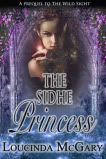
Now, it doesn't always have to be a guy on the cover. This is a
 release coming in the spring, no guy to be seen and even if I hadn't read a most excellent excerpt I'd be dying to grab it. Check this out:
I love the fire and the kickass chick in a dress. It's got the "Ooh pretty" factor in spades. I notice I head for a lot of the female-centric covers, actually. For one thing, I know they're likely to be urban fantasy, which I've suddenly gotten into, but also, the image of a gorgeous, empowered woman who looks ready to take on the world is something that appeals to me. Take, for instance, the cover of Nalini Singh's Guild Hunters series: gorgeous heroine with weapons AND wings? Yes, please! I think maybe this is because we know, as the reader, that we'll be seeing the world through this heroine's eyes. We obviously want her to be as amazing as possible, since for the duration of the story, in some sense, we are her.

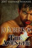
So what draws you to a cover? For me, it is less the gender of the person on the cover than the general feel. I want dark, lush, sensual for both paranormal and erotic paranormal. If it's an urban fantasy, I want warrior hawtness. I want the atmosphere of the book in a single mouth-watering shot. Which is why I'm pretty excited about the cover for my January release, Midnight Reckoning. I know, I know, shameless plug, but seriously:
So let's talk covers! What do you look for? Do you have a recent favorite? What makes you stop and grab a book?
I've got a signed copy of Dark Awakening for one commenter who I'll select at random. Aunty will announce the winner tomorrow, so be sure to check back!

















51 comments:
A naked Paul Marron will get me to buy the book no matter the topic or genre!
Your "Midnight Reckoning" is pretty awesome, too, wolf and all.
Of course, covers have to not only look pretty and striking but give the potential buyer the genre it's in. So, for straight scifi/fantasy, I don't expect naked pecs (although very appreciated) as much as any flavor of romance. Some people grouse about the lack of eyes of the models on the covers but I'm okay with that especially since the eyes of the model may not match that of the character.
I still love J R Ward's "Lover Avenged" and "Lover Mine" (the book that made me read the series in the first place - yes, the cover was that good).
My favorite cover at the moment would have to be Christina Brooke's Heiress In Love. Mostly because my favorite color is pink.
I like a cover that grabs me right away and it's not always the same aspect that grabs me. It's the uniqueness of each that gets me I believe. Now there are times I've loved a cover but once I've read the description on back I've put it back down. I'm a very choosey reader and don't always go by what everyone else is into. I try to look around on my own and see what calls to me.
Congrats on the release, Kendra!
Nomnomnom...chocolate...*cough* :)
Like you, for me, it's more about the feel than the gender of the person. I'm drawn to dramatic covers, whether it has a nifty colour scheme or characters posed mid-action or just a dramatic design. Also, covers with characters who look like they can kick ass will make me take a second look.
At the moment, I'm quite liking the cover for Seanan McGuire's upcoming fifth October Day novel, One Salt Sea.
Colors definitely catch my eye first, then the picture and title will make me take a second look.
Congrats on your great covers. Looking foward to reading the books too, they sound great.
A cover that just pops. Easy to read title & a graphic that matches it.
A sexy half naked man will get my attention every time! Sexy abs: I will definately want to lick...I mean look at that. ;)
Even though I love looking at pretty covers, I will not buy the book unless the story sounds good to me. I might repeatedly look at the cover, especially online, but I won't buy a book unless I will read it.
Well done Sheree have fun with him
Whoo Hoo waving Hi to Kendra and Aunty Cindy.
I so love your stories Kendra and the covers, I really need to put my order in for my books and yours will be on it (it is already on my must have list).
As for covers yep love them and of course it is always the cover that grabs me first then I read the blurb and if I like the blurb I buy the book.
One of the best covers I have ever seen is Denise Rossetti's Theif of Light man is that an awesome cover.
Have Fun
Helen
A good cover is one of those things that I don't know what I like until I see it. I like that there are more covers with whole bodies lately instead of chopped off heads.
I think it's actually the title that grabs my attention first. I love paranormal so I look for titles that seem to have something supernatural in them, if that makes any sense. Commenting before coffee is never a good idea.......LOL
Lori
Good morning! Wow, I just got up, have like half my face in my coffee, and here are all these lovely comments waiting for me. I'll try to be coherent. It's early.
Sheree, there is NOTHING wrong with Paul Marron. Is he on Alix Rickloff's Lord of Shadows? Because I snapped up that hotness immediately. Thanks for the compliment! The art dept. at Grand Central is making me a happy girl:)
Lolarific, that's SUCH a pretty cover! I love the ones where you can see all the details of the dress. Okay, so I'm a historical dress ho too. I grabbed Collette Gale's Bound by Honor a couple of years ago in DC, picking it up initially because it's one of the prettiest covers I've ever seen. Also a good story, but it was the gorgeous dress that caught me! I'm picky about my reading too...but an amazing cover will definitely get me to read the back, which is half the battle.
Pissenlit (my God I love your handle!), thanks! I think there should always be the option of a chocolate-dipped hunk, you know? I tend to lean towards darker, dramatic colors...I was psyched when I saw Midnight Reckoning. My first reaction, I kid you not, was a gleeful "It's so PURPLE!" That Seanan McGuire cover is definitely eye-catching. Made me go read the description...and now I want to try the series!
Hi donnas! A good title definitely can't be discounted...especially because it is HARD to come up with something fresh!
marybelle, exactly:)
June M., you know, I will admit to not having been a huge fan of the headless chest cover in the past (which is why most of mine are like that...the universe has a sick sense of humor), but turns out it just depends on the way it's done. There are some, like Cheryl Brooks' Cat Star Chronicles covers, that I loooove. And I really am thrilled with the way mine turned out (the preliminary cover for Dark Awakening is still on Goodreads, for whatever reason, and if you look you'll note the entire guy was originally seen...whoever he is, YUM, but I actually think the final cover works better). So the, erm, atmosphere surrounding those delicious abs is very important too. *ahem*
Hi Helen! *waving madly* Oh, I hope you enjoy the book! The Rosetti cover is PRETTY. Is that a good series? It sounds very cool!
Hi Maureen! I'll admit, I do like to see the head. But that can be a double-edged sword. I love me some cover hunks, but I'm not always into the particular guy they put on the cover...so I can understand the chopped or partially-chopped heads. It allows for imagination to fill in the rest! Do love a pretty face, though...I just read Kristina Douglas's Raziel: The Fallen, and I'd been admiring that cover for a WHILE. You can see his face, but not his whole head, and omg the bod, and the wings...*happy sigh*
Hey, Lori! Good morning! I am one cup into my day. Need more. Ugh. I do like a good title, for sure. Coming up with an original, unused paranormal title is NOT easy! I always end up on Amazon during that part of the process, grumbling: "Crap, that's taken. And that. Noo, that's taken too!" There should be more words that evoke sexy and spooky!
Hi Kendra! I love a cover with a guy on it - it will grab me before one with a woman on the cover. But, I think the color and the layout makes it a favorite or not - if it "pops" it gets me.
A recent favorite? Jaci Burton's "The Perfect Play" - I could stare at it all day!
Hey Robin! Oh man. That's hot. I could stare at that all day too! It's funny...possibly this is because I'm not an artist, but I'm not sure I could define what "pops" for me...I just know it when I see it! Looks like we all feel that way:) And, of course, we are all suckers for a hot chest!
I like a good use of color and space on any book cover. I don't like it if it's too busy. But if you put a shirtless lean guy on the cover my eyes are pulled to it like a tractor beam. :)
Thanks for the giveaway!
jcross719 at yahoo dot com
Hi Jess:) No, too busy is bad. I mean, I have a soft spot for some of the old Fabio covers, but...do we really need a rearing horse in the background? Or the strategically placed Sword of Virility jammed in the ground? I like the focus on the figure, not on background. And of course, a nicely sculpted man torso is always going to catch my eye too!
Sheree got the GR !! Don't judge him by his cover. He looks sweet and innocent in all those feathers, but beneath them beats the heart of TROUBLE!!
Love those covers, Kendra!
Some friends and I were discussing this the other day. Johanna Lindsey's latest cover stopped me in my tracks at the local Walmart. When Passion Rules has one of the most arresting covers I've seen in a while. Something about a half-naked guy in tight white breeches. SIGH
Hey Louisa! Ohhh...I had the same reaction to that cover! Stopped me dead in my tracks. I'm a sucker for tight breeches. It's an incredibly well done cover. Glad you like mine too:)
I cannot resist a dark paranormal romance, especially one with a beautiful cover like those for Kendra's books.
When it comes to covers, I'm drawn to all kinds because I do read various genres in romance. I appeal to those with vivid coloring (gloss as opposed to matte) and matching colour combinations. Often if a man/woman is front a center I would prefer their face to not be so obvious, because sometimes I have a different mental image of the man/woman and it can distracting if they don't match. If a face is shown, it might be strategic to have it a bit in shadows, this works well for paranormal and gives it that mysterious, haunting quality. I read paranormals, and I am not a big fan of bloody lips or dripping blood or fangs on the covers, it's a bit cliched and obvious for me. I prefer subtle and sensual and mysterious, it leaves more to the imagination.
Covers I like, Susan Wiggs's latest (contemporary romances) such as Passing Through Paradise.
Kristin Hannah's covers for Night Road, Winter Garden etc. (women's fiction).
I LOVE Karen Marie Moning's covers for her Fever series (urban fantasy).
Sherrilyn Kenyon has nice covers for her Dark Hunters series as well (paranormal).
Current favourite, Diana Gabaldon's Outlander for the 25th anniversary edition.
All these covers appeal for different reasons, but they are reflective of their genre.
I enjoy good looking people on the covers and like the partial faces - the reason being that some faces may not work for me but who can resist a gread bod lol. Midnight Reckoning is just perfect!
I so agree. Covers are extremely important. I write historicals so the look and feel are a bit different than for the dark paranormals. I love the clothing of period historicals so a luscious dress is a must. I've had three covers with just the heroine. This is my first cover with a hero as well and I love it. Color is important. I love a cover while the covers pop. I like covers that reflect the time of book as well. Love Kate's mystery covers but they wouldn't work for an historical, know what I mean?
Actually, it's probably easier to spot a cover I don't like than one I do because so many covers are grabbers. Yours is great.
Morning Everyone,
Glad to see you are enjoying our choccie covered hunk. And THANK YOU, Kendra for bringing him to the Lair!! ;-) We'll have him sparkling clean in no time... but we do have a chocolate fountain, just in case!
AC
Congrats on nabbing the GR, Sheree. As Louisa says, he may LOOK sweet and fluffy on the outside, but inside... TROUBLE!! So keep a close eye on him today.
AC
LOL June, on those sexy abs! We know exactly what you meant. ;-)
Hi Helen! You are sooo right about Denise's Thief of Light. That is one GORGEOUS cover! Same with Christine/a's Heiress in Love as Lolarific pointed out. Actually pink is NOT my favorite color (not even in the top 5) but that cover REALLY grabs you!
Of course, my FAVE of all Christine's covers (and it is hard to chose coz Sweetest Little Sin is FABULOUS) is The Dangerous Duke. Those marble columns, that lilac bush, those apricot shoes...
PERFECTION!
AC
Thanks for dropping by Na!
I know what you mean about faces not matching up to the writer OR reader's mental image of the character. I think that accounts for the popularity for all the headless torsos on covers. My DH (the artist) HATES them, though he's okay with the face in shadows.
I gotta say that of my three covers, I do like the one where the guy has a face the best...
And I have to agree with EVERYONE -- Kendra's covers are YUMMMMMMY!!!
AC
Hi Catslady!
Glad you could join us today. I gotta agree about the hot bods. GOTTA LOVE 'EM! And BOTH Kendra's new books have GREAT looking hunks! Aunty predicts these books will FLY off the shelves... coz in addition to the great covers, they happen to have great stories too! ;-)
AC
Hi Donna!
Hope it is cooler there in Ohio than it is here in NorCal! UGH!
Anyway, I totally AGREE with you about historical covers and your new one is FANTASTIC! LOVE those heroines with their beautiful back exposed, like your "Mrs. Brimley" cover. Several of Christie's have wonderful "back" shots too! Something Scandalous is SOOO YUMMY! And so is Scandal of the Season...
Oh, and can't forget to mention Fo's My Reckless Surrender!
AC
Aunty, you're aware that you are the sweetest, yes? I think you get to dunk (and clean) the Chocolate Hunk one time all by yourself:)
Hi Na! Those are excellent covers you picked out. I prefer sensual and mysterious too! And lovely glossy covers.
catslady, thank you! Whoever the hunks were who posed for my covers, they've done an EXCELLENT job cultivating touchable bods!
Donna, I absolutely love historical covers. They wouldn't work at all for my paranormals, but a lot of them are so lush. I love the dresses, the clinches...awesomeness. And you're right, there are a LOT of grabbers out there!
LOL Kendra!
I'm actually quite sour... but it's those high blood sugars that fool ya! ;-) I will, however, gladly undertake cleaning duty of this particular guy.
Yes INDEED! The hunks on your covers are doing a MOST EXCELLENT job! And I LOVE the whole dark and mysterious feel of your covers.
AC
I love looking at covers. For me, a good cover is what makes me first pick up a book.(I know this is bad) I like covers that reflect the characters inside. I absolutely hate when the cover models look nothing like the characters. I will say when it comes to PNR books I don't mind man candy on the cover but I don't like them as much in historicals. I to see couples or pretty dresses in historicals. My favorite cover ATM is Kady Cross's The Girl in the Steel Corset.
Hey Danielle,
It's not BAD to be attracted to a great cover. It's all about FIRST IMPRESSIONS! So if a cover compels you to pick up the book then it is doing its job. ;-) And yes, a bit of man candy never hurt a cover, IMHO. :-P
AC
Welcome back, Kendra! Love your covers and congrats on the release of Dark Awakening!
I love the cover of Julia Quinn's JUST LIKE HEAVEN. The colors are wonderful and I love how the red pops :-)
Love your covers, Kendra! Best of luck with the new book! xoxo to you and Aunty as well as all the Banditas!
I'm not too picky about book covers, but def appreciate mostly naked men with no faces. I was disappointed in the Guild-Hunter covers, they got the colors wrong, and it annoyed me the whole time!
LOL! You know me, Kendra. A hot, naked man will do it every time. Congrats on the new release!
Kendra
Denise's series is a fantastic series as well as having awesome covers. I forgot to say as well thank you so much for that chocolate picture just what I need to warm me up here in a very cold Oz at the moment LOL
AC
I too agree Christina's cover is beautiful so elegant and eye catching
Have Fun
Helen
Kendra, I am not a cover person. I usually don't even look at covers...but I know I am unusual in that regard. BUT, I LOVE your cover...something about a leather jacket and pettable abs works for me. And I must admit it took a few minutes for me to look away from the guy covered in chocolate! I would buy that book, too.
Lots of luck with your new book!
Danielle, it's not bad! Well, if it is, then I'm bad too, because covers are almost always what make me grab a book initially. So much pretty eye candy:) The Kady Cross book is GORGEOUS (I'm having so much fun checking out all of your faves, ladies!).
Hi Beth! Thanks, this is ALWAYS one of my favorite stops! I love that Julia Quinn cover. I keep looking at it in the store, and I've heard it's a good book as well. I'm probably going to break and get it despite the already enormous pile I brought home from RWA.
Thanks Marie!! I love your covers too, as you know:)
Jen3128, yeah, I wish they'd done the colors more accurately...but I think the cover model is beautiful, and I'm usually kind of all about wings on covers. Love 'em. Hooray for mostly naked men!
Cheryl, as it should be:) And your covers are shining examples of that! Thanks!
Helen, thanks for the recommendations! Fortunately, there are lots of books to get you through the winter. I'm actually a little jealous. It is miserably hot here right now!
Hey Theresa! How've you been? I'm glad you love the leather and pettable abs...it really works for a bunch of sexy cat-shifting vampires, I think. I would buy the chocolate guy's cover too. Actually, the real deal would be nice too. Sadly, it's only fantasy...and I don't think my DH will let me dunk him in a vat of chocolate!
@Kendra, yes, that is Paul Marron on the cover of "Lord of Shadows". Yum!
@Robin, "The Perfect Play" has Jed Hill on the cover.
@Louisa, "When Passion Rules" has Paul Marron!
By the way, the guy with the chocolate on his hand is Matthias Streitwieser.
Yes, I do know other things in life than hot male models. :)
WOW Sheree!
I guess we know WHO is the font of knowledge about cover hunks around here!
Thanks for the info... now back to drooling. ;-)
AC
I agree about Paul Marron half naked on any cover is all good! Jaci Burton's a Perfect Play cover was smokin' but I hate headless bodies! I like the full meal deal! LOL! I'm also a fan of humorous PNR so I think cartoony covers are cute! Like Molly Harper's How to Seduce a Naked Werewolf. It is annoying when the cover models totally don't match the characters in the story. I just bought Lori Foster's book When You Dare cause the hot cover caught my eye! Thanks for sharing today!
You do have some great covers, Kendra. I know this is so sad to admit, I cannot walk by a cover with a hotty in a kilt. I love Scotland and all things Scottish, especially those Highlanders. Well, at least I admit it. Most every story I read is historical, its what I write as well.
I know, Aunty Cindy is rolling her eyes and nodding her head because she knows of my addiction.
Nice to meet you today, Kendra.
Hello Aunt Cindy and Kendra, Thanks for inviting us to your Lair. Of course a good cover draws me in to check out a new author. And If I like the author I will grab everybook she writes. Great Cover or Not. Take Charlene Harris. Her Covers our comical to me. I delayed picking up her Sookie Stackhouse Series, because it was cartoonish. Once I read The books. I didn't care about the silly covers anymore. But Kendra your covers say dark, broading, kickass, sexy, raw, desire. A Awesome Hero who's probabably going to boink you until you can't stand.
The last book I picked out was actually a Scottish based historical by Karen Hawkins and I was drawn to it because the cover was unique it that The first book had a pretty blonde lass pulling a kilt attached to her Laird and you don't see him, but the next book in the series has a Sexy Laird in a Kilt with his kilt being pulled to the left and you don't see the lass. But if you put both books side by side they continue a picture and the story and the series. I have to say it's a kilted guys legs and footwear that pulls me in. Just like a Hot bodied Guy in Black leather pulls me into Paranormals. And Kendra today at my Barnes & Noble "Dark Awakening" had only two books on the shelf of yours and they were far back. I pulled them to the front of the display shelf. I bought one, now there's only one. "Midnight Reckoning" pulls me right in too.
Sheree, you are officially awesome. You may know more than hot male models...but the question is, do you really need to? What an excellent area of expertise!
Johanna, the cartoony covers can be very cute. And they definitely tell you what the tone of the book is, always a good thing! I had a look at that Lori Foster cover. Yummy.
Nice to meet you too, Paisley! I have a kilt addiction too. There is no shame in loving the kilt! I write contemporary paranormal, but I've done three Scottish heroes so far (Dark Awakening's hero, Ty MacGillivray, included) because I can't. resist. the. accent. It's like chocolate for the ears!
Hey Donna!! Oh, I'm glad you bought the book! And thanks for rescuing the other one:) You'll have to let me know how you like it! Cute about the Karen Hawkings books...I like the idea of doing that! And LOL at the hero who'll boink you until you can't stand. I am so totally fine with the cover art invoking that!
What grabs me? Color, flash, heat,
and TOUCHABILITY!! (That's my new
word, but any of you are welcome to
use it!) An example? Try Vicki Lewis
Thompson's Sons of Chance series, in
particular "Cowboy Up!"
Pat Cochran
Pat, it's a great word. And it sums up exactly what I'm looking for in a cover! You should copyright the term or something;)
I buy my bks online & don't pay that much attention to the covers. My bk selection is usually based on the synopsis & the reviews & if available the excerpt.
I can tell you of 1 book that I would have never bought if I'd judged it by solely the cover: Gail Carriger's Soulless which was a superb read but had the most horrible cover. I wouldn't have guessed it was a PNR from the cover!
uh didnt get past the chocolate hunk
like strong women and hunk men, i like the men usually just neck down, so i can picture the guy myself
Post a Comment